

Today I’ve got three cards all using the same image and all kept pretty flat for a change!
I used a Connie Fong digital stamp that I had been given for a Design Team a few months ago and had printed a few times so thought why not use that and colour it three different ways to make up some cards that were similar but different!

I used patterned paper from the stash and this time kept the sentiment off the front and instead stamped the inside of the card instead.
The first one I coloured using stampin up inks and water with a brush.
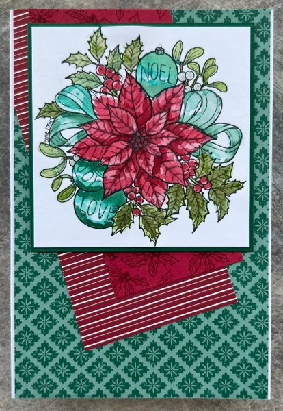
The colours are really vibrant and as I had used teal type colours I went for the blue toned greens for the background paper.

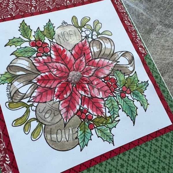
For the second card I used distress inks and more water so it is a little bit lighter. I also added some shimmer ink for the baubles and the centre for the flower.

This time I chose browns for the ribbon rather than blues. So the green background is garden green which matches with the leaves I think. I really like the pop of the shimmer and the brown ribbon.
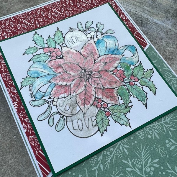
The final one I went all in with the shimmer watercolour and did the whole thing with them. This gives it a much softer look and clearly everything shimmers!
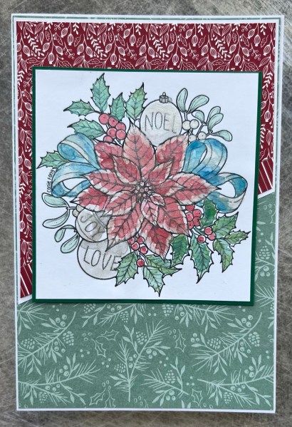
I went back to the blue for the ribbon though as I wanted a bit of contrast. But this time I went with the soft green of soft succulent in keeping with the softer look of the painting.
So that’s three cards using the same image but each coloured differently for three slightly different looks!
Happy crafting!
Catherine
