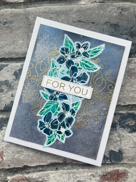
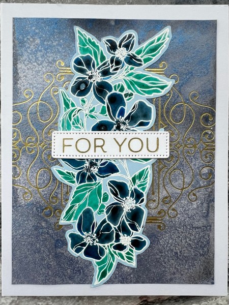
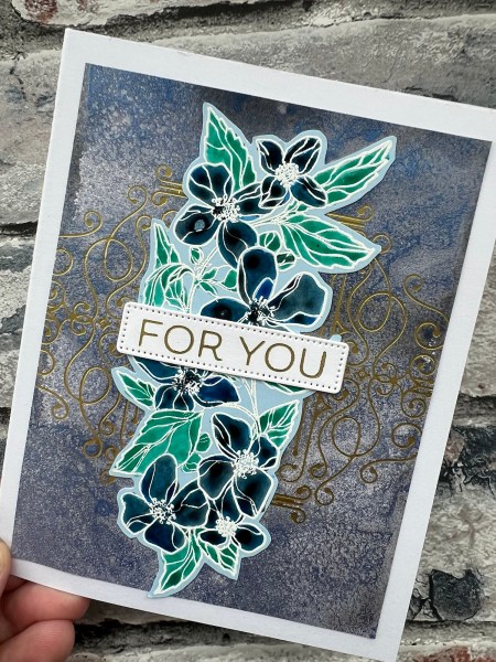
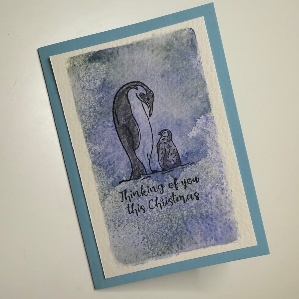
The lovely thing about shimmer spritz from Kingston Crafts is that you can use them on dark cardstock including black and still enjoy the shimmer and shine and sometimes so different colours emerge as a result of the different background.
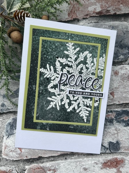
On this one I spritzed the white spray onto the black and let it dry – and when it did the mica have a definite green hue – so that was the colour I went with for the accent colour.
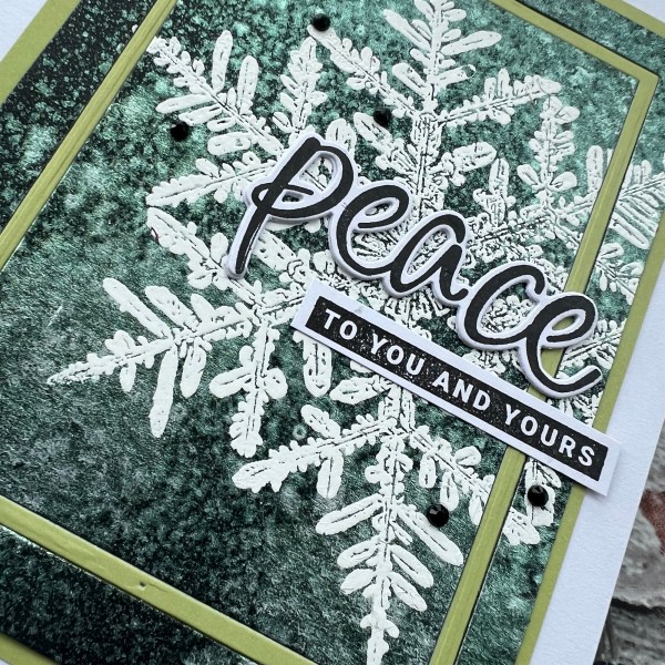
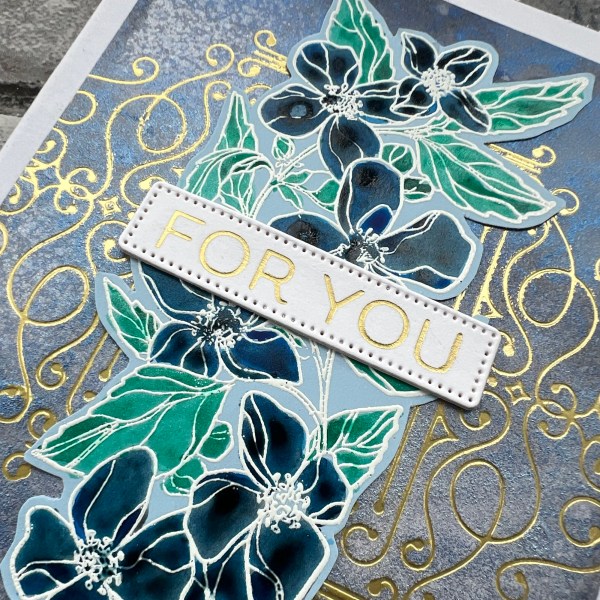
Of course the Snow Crystal is one of my favourite large stamps for using with different mediums – it really works with a slightly grungy or messy background – especially when embossed in white!
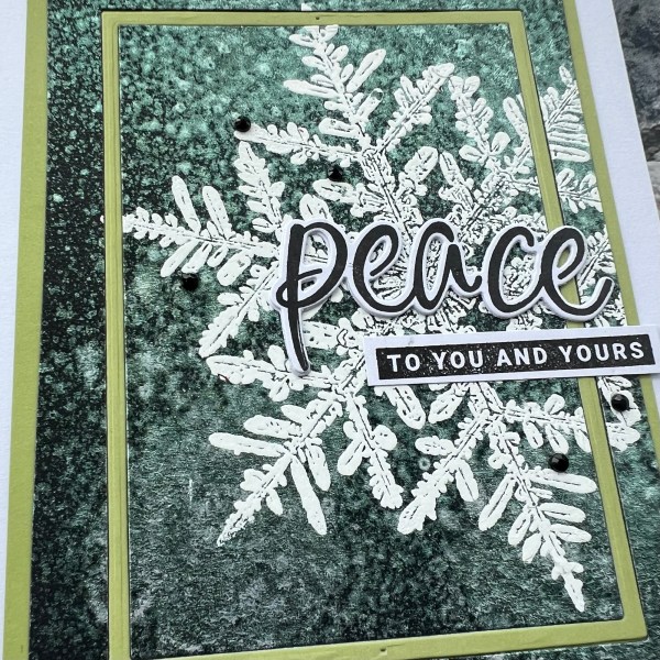
I die cut the panel with a slim frame rectangle and the same from the green so that I could inlay the frame and then mounted the panel on the same green.
This green is actually from the pastel cardstock pack from Kingston Crafts and I’ve found that pack of cardstock has some perfect shades to go with the iridescent mica.
I then added a sentiment stamped and die cut Peace and added the stamped rest of the sentiment from Peace and Joy (another old favourite set).
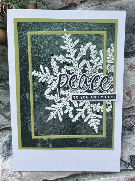
Love how special that mica spray makes the black cardstock – it really does step up the card nicely. And love how when dry the shine doesn’t shed in anyway – the spray seals in the shimmer!
Happy crafting!
Catherine