I am an on-the-side and increasingly up front papercrafter who loves nothing more than getting inky and creating pretty things with paper and stamps!
I am also a wife to lovely hubby and mummy to a wonderful 14yr old princess.
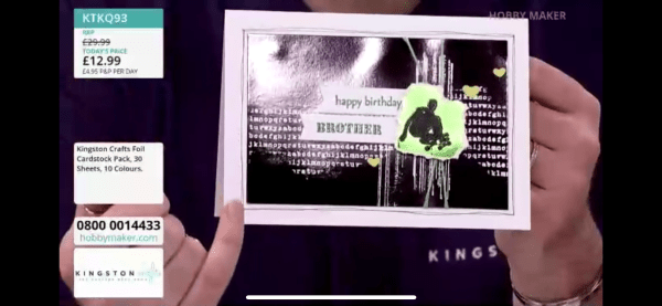
This is another ‘as seen on tv’ project from back in March when Martin was on Hobbymaker with Kingston Crafts – although it was only on screen briefly! I realised I hadn’t yet got around to blogging it so here we go!
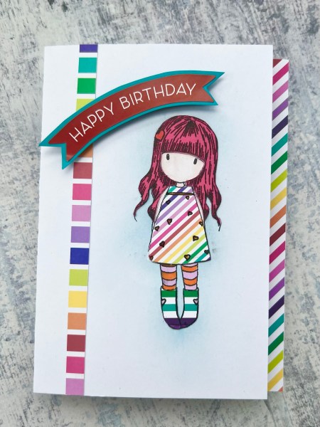
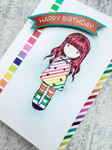
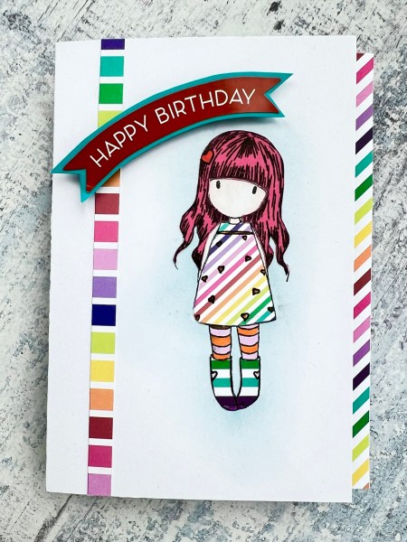
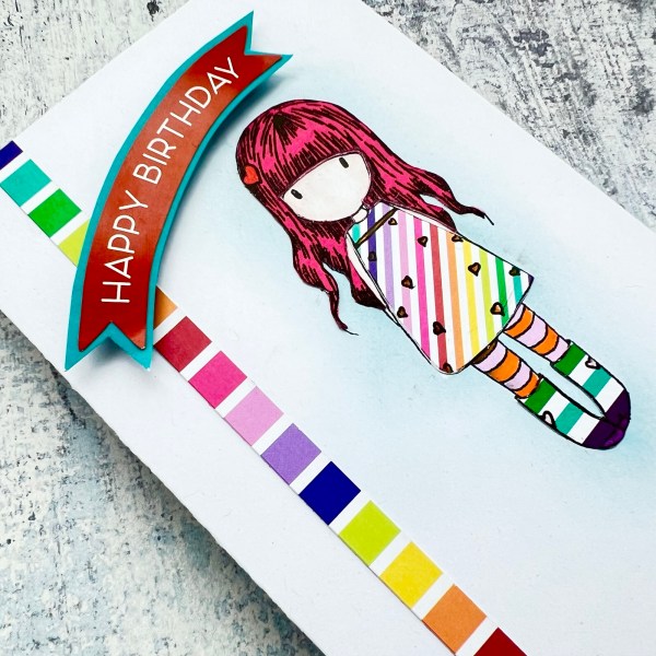
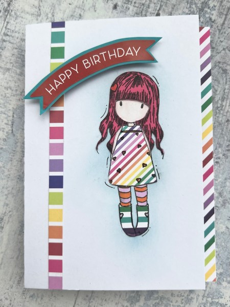
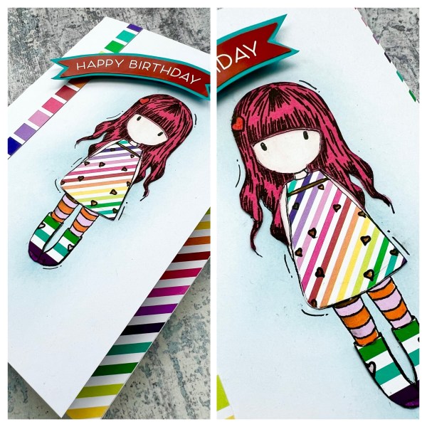
I went for something a little different with this card and did some paper piecing for this birthday card.
I knew that the Gorjuss girl would look lovely in a rainbow outfit and so stamped her on the white card blank, some diagonal stripes, some wider stripes and the plain pink. I then used my promarkers to colour her face, neck, arms and then some striped tights. I then fussy cut the hair, the dress and the boots and glued them in place on the card.
I also stamped the image onto a post it note to mask off the image and added some subtle blue ink blending behind the image just to ground her a little.
I then chose to take a section off the front of the card blank so that the inside of the card was peeping out the side and added some of the patterned paper to that.
I also added the strip of the horizontal stripe to the left hand side.
I then went through the extra bits in the kit and I love the Happy Birthday sticker banner. I decided to add it to a piece of the blue card and cut it out so I could raise it up above the girl.
It is quite a simple looking card but those paper pieces for the image of the girl are so cute!
I did then end up doing a simple little extra edit after this … with some little doodles … to be fair it was because I noticed a little smudge and needed to disguise it!
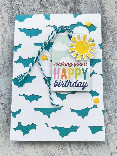
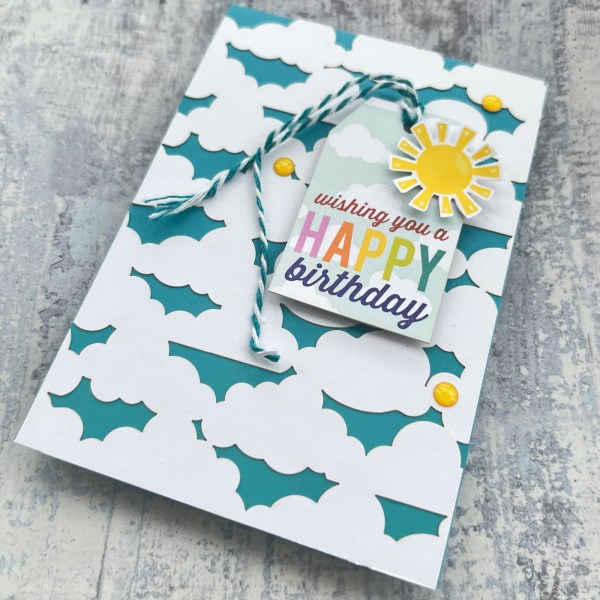
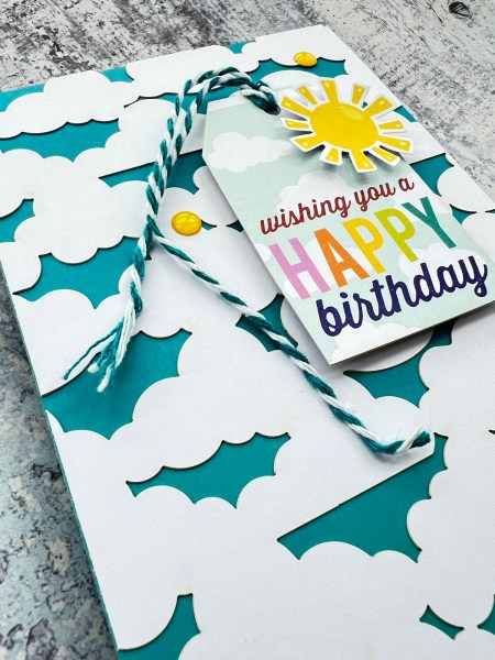
I’m back with another design team project for Addicted to Stamps and More and this time I went for something very simple using some leftovers from the Kingston Crafts rainbow kit to make a lovely cheerful birthday card – birthday is the only rule over on our challenge so a nice easy one!
I started by making a cardblank from the blue card stock in the kit and then covered it with the laser cut cloud card.
Then I used one of the die cut tags and raised it up on foam adhesive – making sure to add the twine to the top – no naked tags here!
I also took one of the suns that was on a 12” strip and fussy cut it out and added it to the top of the tag.
I then added some of the cute enamel dots from the kit and added those … and called it done!
So simple but really effective especially with that cloud background!
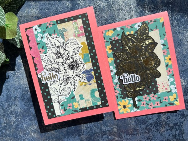
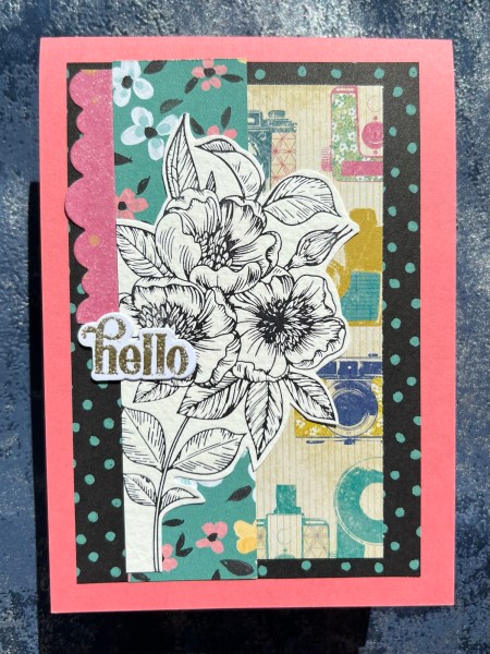
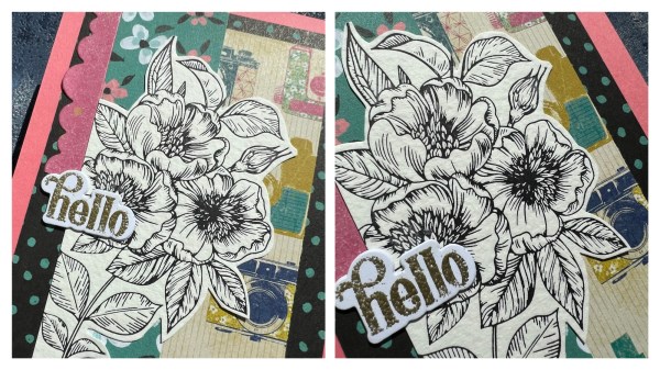
So I had some scraps leftover from scrapbooking and wanted to get them use up and off the desk and I remembered I had these two floral elements I had created when playing with the betterpress and the glimmer machines – I am still experimenting with them and working out the techniques so haven’t shared much using them so far!
The first one I created the panel for the card and then this was a betterpress play where I had done it at an angle off the edge of cardstock. I cut it out and then added it to the card panel.
The panel included part of a die cut using my favourite Bumpy Borders from Hey Little Magpie.
I then added the sentiment that was already embossed and die cut and stacked in my stash.
Really like the mix of the papers and then the detailed image that has that slight texture to it with the betterpress.
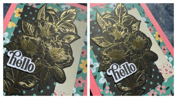
Next I took the other panel of the patterned paper and again created my background. This time it was a foiled version of the same image but on the black.
I had foiled it using the gold foil onto the black cardstock.
Again I added the sentiment from the stash that were already die cut and stacked ready.
The shine from that foil is addictive and the detail for the image is unreal! I can see why people are raving about both the betterpress and the glimmer.
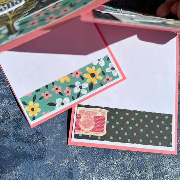
I used a bright pink cardstock for the card blank and then added some more scraps inside the card on the white insert to finish off.
Love how these turned out – and not bad using my experimental pieces and scraps!
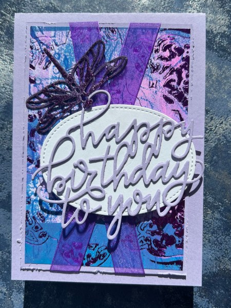
I had another go in trying to foil on a gelliprint with a die and had even less success with a clean foiling than last time but again I decided it didn’t matter and I loved the result enough to make a card with it!
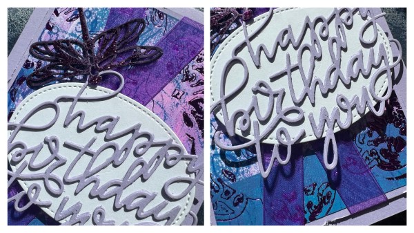
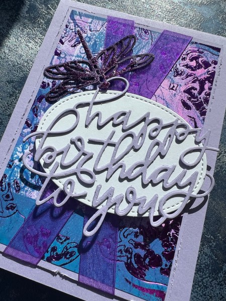
I used some old Spellbinders dies and purple foil and it was on quite an intense gelliprint. You can see some of the detail of the dies but also the over foiling on the right hand side in particular.
I added it to a mount of lilac card and then wrapped it with ribbon.
Next I took a white die cut oval and then die cut the sentiment three times to stack it up. A die like this cuts so well on my Platinum 6 machine – my old Big shot wouldn’t have had a chance cutting something so fine. I stacked it up so it was quite dimensional and then glued direct to the oval die cut.
I added that with foam adhesive for dimension over the ribbon and then die cut the purple dragonfly. I coated it with glitter glue and then added that to the top front of the card.
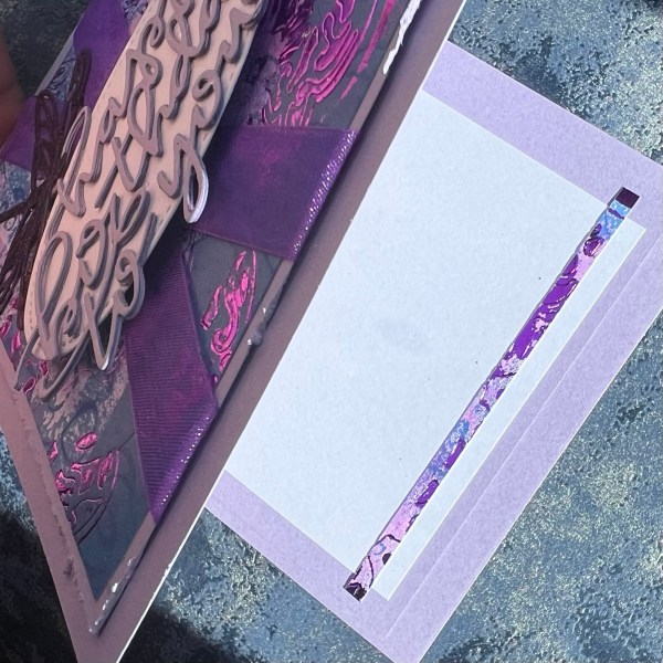
I love how fun this is. I distressed the edge of the panel and then added it to the card blank made from the same colour card.
Inside I added a tiny slither of the background plus a layer of white and lilac as the card wasn’t thick and needed a little strengthening.
I am falling in love with the foiling – still need to perfect my technique but love the shine and the intricate nature of the foiling you can get – I also love it against the mixed media grunge of the gelliprint – it makes a nice contrast.
So I feel like I am on the home run now with this challenge (so pleased I did this pre holiday!) and as always when doing one sheet wonders or using the same supplies over and over I get a little frustrated – so these I struggled with a little more! But still love the end results! Well except maybe one of them! But I will come to that!
What I have loved about this challenge has been the fact I parceled them up after the cutting element so I could just grab a few to work on at a time rather than trying to do too many at once – it has helped with the keeping the interest level up – but even so – I am coming to the end of that now as it’s been 16 cards made so far – and that’s a lot for the same theme and colour scheme! Fortunately for you I’ve kept the blogs separated out a bit with other projects between – but for me I made them over the course of a couple of weeks – I’ll be happy to put aside dogs and cats now for a while!
Anyways here are the four cards I made in this session!
This is one of the funniest layouts I think I’ve ever made with the cross cross patterned papers but I think it works! Not sure it would have worked with a softer type of pattern like a floral but you never know! It was fun to try regardless.
The actual sketch suggested another cross cross than I included but I like seeing more of the background navy so discarded two small strips of paper.
I added stamping and clear embossing to the green panel too to add an extra element as I felt it needed just some interest in the background.
This one I also altered the sketch because I had directional paper that didn’t work with the orientation of the sketch – but even switched around it worked ok.
I was undecided on whether to go with the bigger kennel paper or smaller kennel paper (Kingston crafts has double sided paper with the same design but smaller/bigger versions so you can choose which works best for your project)… and in the end decided on the bigger print as the design had a lot going on and the smaller print looked too busy!
But then I also added in the hearts I had fussy cut from the packaging of the kit – so this did end up very busy!
This one I added the embossing to the navy panel which is like a sun radiating out type design. It added some subtle detail.
I also amended the sketch for this too – changed the placement of the banners to accommodate the directional pattern and had it hang over the edge of the topper – this works because I was mounting all my card toppers onto 5×7 card blanks. I do this because the sketches are designed around US size cards and they are slightly different from UK ones (slightly wider and shorter than our A6). It does however give me the added advantage of being able to overhang elements which I like.
I also added in extra banner tabs with the sentiment and one other plain colour one to help balance it out in this different placement.
This final one – I do like – but this was the hardest for me! The sketch called for circles and I just didn’t love how this worked – so then I tried to bring in the doodles and I might have gone a tad overboard with the doodles and the white pen. So I do like the final card but I don’t love it!
Again I had slightly changed the sketch so it was reversed to work better with the way the poodle was walking and one of the patterned papers I cut into two smaller circles as I didn’t have a circle die of the right size. Plus added the sentiment as a banner strip.
You may have seen that all the cards I’ve made for this challenge have had bright coloured envelopes which coordinate with the cards – in most cases the yellow ones. I didn’t do anything for the insides of the cards but added fun coloured envelopes instead!
And so I have two more cards left to make and then I am going to pack up the remainder of the pet collection kit and pop it towards the bottom of a box for a while. I think there is still enough to make a good number of projects from albeit no full sheets of paper left and only a smaller number of die cut elements left – but after the last two cards it’s unlikely I will want to grab it again to play with for a while – I have so many other things in my craft room I want to play with!
Hope you’ve enjoyed this series over here on the blog though – it’s certainly been a change of pace from floral overload I normally go for!
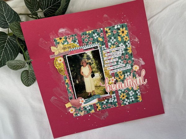
I made this page months ago but because I was mid sharing design team projects I never got around to sharing on my blog at the time.
It was made in response to two challenges – firstly the sketch from the March 1 sketch 3 ways Facebook group that my lovely friends Helen, Sarah and Janet run. They provided this sketch …
And this is what I made…
I kept all the elements of the sketch in – but obviously added more stuff too!
The second challenge was at the Bash Your Stash Facebook group where the April challenge was to use flowers! So the floral paper worked for that along with the flower stickers and other elements I added in.
I didn’t film this one so I’ll explain what I did for it.
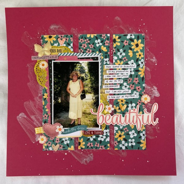
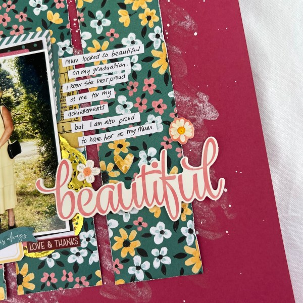
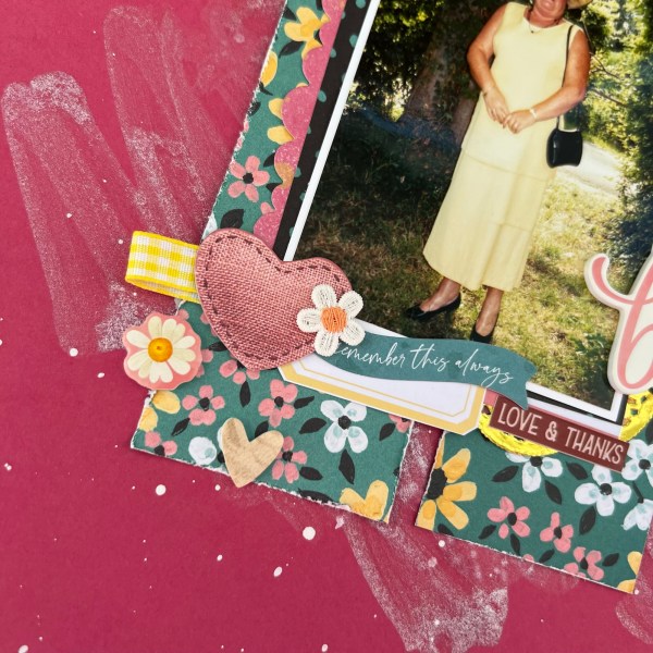
The picture is of my Mum at my graduation back in July 1999. And I think she looked amazing! Definitely better than I did that day! 🤣
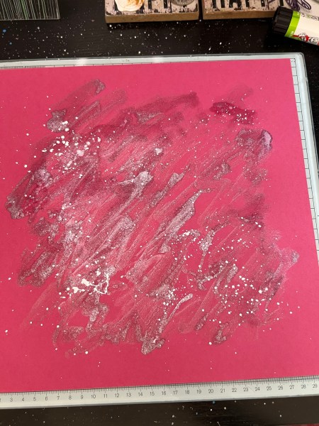
The sketch suggested some mixed media in the background so I used the Kingston shimmer spritz but painted it roughly over the background rather than spraying it – this meant the mica was in different intensities for the background. I then added a large amount of white gesso splatter for contrast too.
I then set it aside to dry – I mean it looks like a right old mess! But I knew it would be fine once I covered most of it with paper!
I then grabbed the paper and cut it into 2.25” strips and then cut it down a by about 4” so it would work as a square block when I put it down over the messy background.
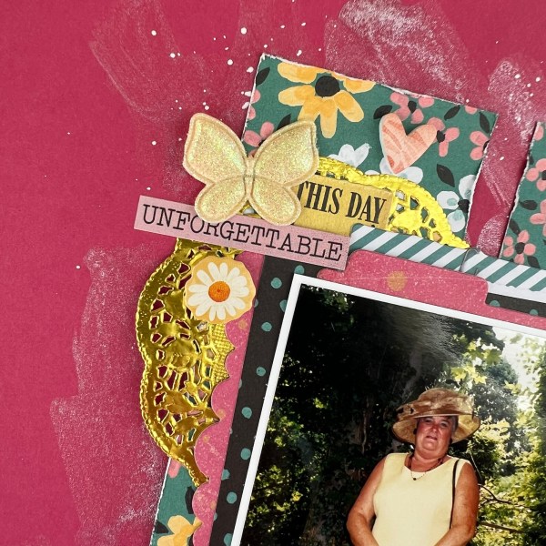
I added a white border to the picture and then the reverse of the flowery pattern is the black dots so I added that as a layer too. I also had some scraps of a pink textured type paper so I grabbed my Hey Little Magpie dies and cut the bumpy border for the left hand side of the photo and a tab for the top. These dies are so handy for these sorts of elements – that bumpy border is a real favourite of mine!
I then grabbed lots of bits and pieces from the embellishments box including the gold doilies from the February embellishment kit from Hey Little Magpie.
I chose my title from a Simple Stories puffy sticker set and then just worked through random stickers and the 49th & market embellishments to add layers behind/to the side of the photo.
I then added my journalling onto white strips of card to add to the page as I didn’t have anywhere clear to write my journalling.
It was good to use up bits from the March Hey Little Magpie embellishment kit too to add in the yellow… like the ribbon tab I made and the little fabric daisy.
I’m really pleased with how this page came out and good to get two challenges in one done for this page. Sorry it’s taken so long to share it here! But got there eventually! And also good for me to have a prepped post for whilst I am on my holiday!
I love how shimmery the background is too – I don’t think the photos show off the shine – but it’s super shiny!
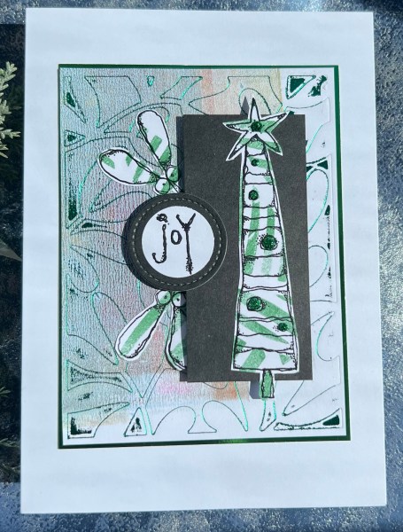
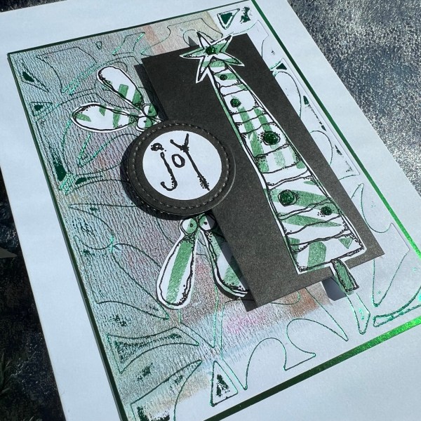
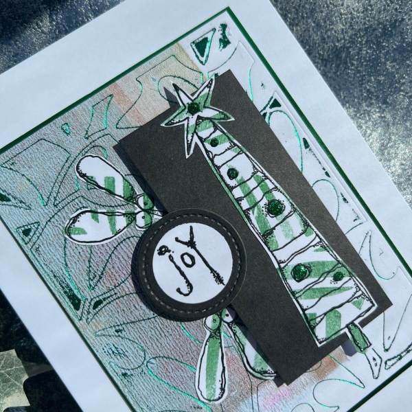
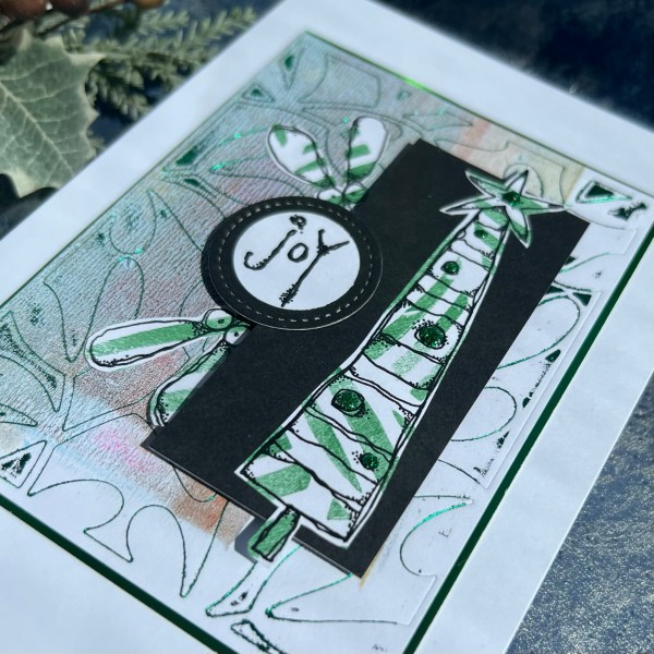
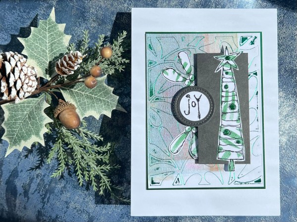
Back with another Festive Friday project and this time I was experimenting with dies and my glimmer machine and decided to give a try of foiling a gelli print to see what happened – so what happened was the foil stuck in some places it shouldn’t – I suspect I need to adjust the sandwich a bit – but because it’s an experiment and already on something a bit different I went with it!
I actually think that the background was a wipe up piece from the gelli printing session rather than an actual gelli print but that means multiple colours and some odd lines and shapes! I used a mistletoe background die I got some time ago and haven’t yet used – so this was my first time taking it out of the packet! Odd that my first choice for using it was for this experiment but there you go!
I used the green foil and then trimmed down to the usual size of the die (the dies give an impression so it’s easy to see where the outline was) and then mounted it onto green foiled cardstock.
I then took another of those backgrounds from the gelli printing session – pretty sure this was a gelli print through a leafy stencil and stamped and embossed the Kate Crane Paperartsy tree and the mistletoe images and the Joy sentiment onto some white cardstock.
I then cut a black rectangle for the tree to sit on, and a circle for the sentiment to sit on (I punched the sentiment out).
I added adhesive foam under the black panel and the circle sentiment so it raised them up.
Once everything was adhered down I used my green glitter glue to add to the baubles on the tree – so there was yet more shine! Three different types of green shine in total!
Love how this came out – a bit grungy and very funky and a great use of the gelli print backgrounds that have been sat there for some time!
Also loved that die and glimmer foil experiment- again I suspect the over foiling came from not getting the sandwich right and maybe the paper was too thin so bent too much when it went through the machine.
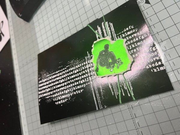
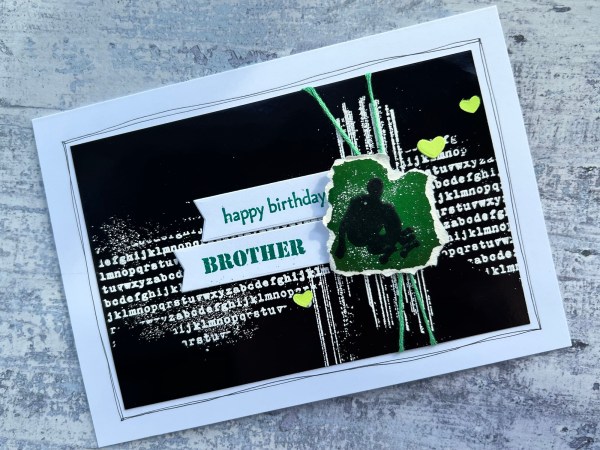
So when I was sent the rainbow foil cardstock from Kingston Crafts to play with for this set of design team samples I was told the black was lovely … and gosh how right that was!
And although masculine cards are normally my challenge I decided that this black would be perfect for a teenager style card – obviously skaters could be masculine or feminine – but potentially more for the male teenagers I have known than the female! – so don’t worry I know the image could be for girls too – just not the girls that I have had experience of making cards for!
I had in my mind the messy stamping and embossing on the black background and then the embossing on a pop of colour for the skater image.
I was delighted with how it turned out!
The good news is you can emboss on the foil cardstock but keep the heat in short bursts and don’t overheat as it can turn the foil slightly dull – in the case of the black I managed that fine – but on the green I did overheat it so it became more of a satin finish. To be honest for this small image I was absolutely fine with that and in itself it is quite a nice effect – I’m just telling you so if you replicate be careful if you want to maintain high gloss!
I wrapped some twine around the card under the image and popped it up on some foam square so it has some dimension.
Next I took some die cut banners and embossed the sentiments on – just so you know when it’s a sample for DT I make cards I don’t actually need to send – so this isn’t really a card for my brother (he definitely isn’t a skateboarder!) – but you know this is the sort of thing I do when I make DT samples – sometimes they are just showing the possibilities!
Anyways I chose to emboss with green to make it in keeping with the pop of green against the black and white.
I then added the little green hearts from the stash – these are normal cardstock but I think the matt finish works well with all the shine!
Martin did show this one on tv so once again I can say the words – ‘as seen on tv’! 🤣
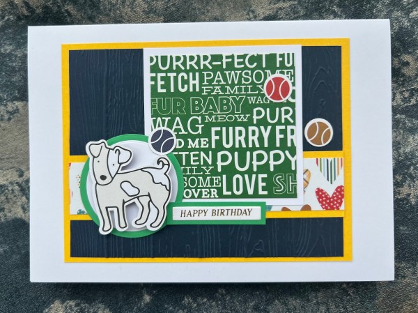
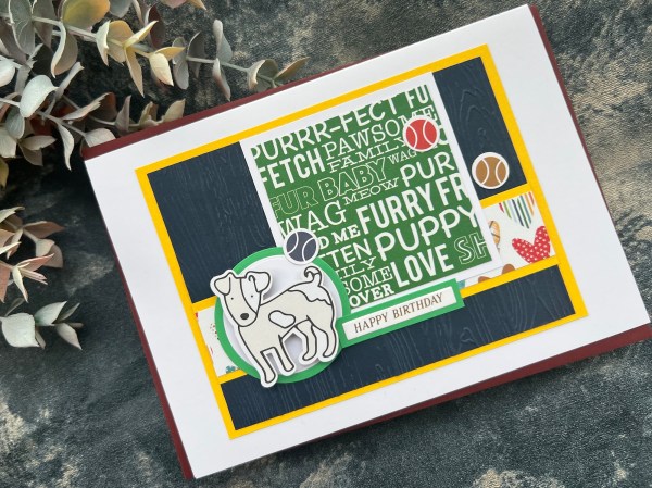
Here is another pair of cards made using Kendra’s card challenge.
For these I added focal elements of stamped and coloured images from the My Favourite Things stamp set that I’ve grabbed a few times when making these cards. By this point I was running out of dog die cut pieces from the kit so it works well to add in stamped images to carry on playing with the kit!
This one I wasn’t totally sure about as the wonky panel had a directional patterned paper but I think it looks ok.
I added a sentiment which was a foiled press plate from the Dina Wakely spellbinders set – I die cut it twice to stack it and think the green foiling on the yellow card is cute!
This one also used the Dina set of sentiments but a different one.
On both I added texture to the background with a dotty embossing folder – I chose to have one with the dots sticking out and the other with the dots indented.
I love how that texture looks so cut with the layers of patterned paper on top.
For the second card I added gems and the twine from the kit to add embellishments.
Love how both cards turned out – especially love that second card – love the navy and yellow – and that poodle image is just so cute!
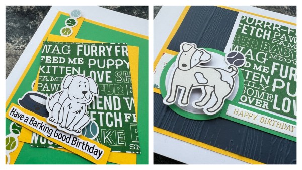
Back with another pair of cards made using the Kendra’s card challenge – this time it is sketches 2 and 4.
For both of these the focal images were die cuts from the ephemera die cuts that came in the kit.
To one I added the sticker that is all the balls and had it hang off the card topper slightly at top and bottom and the other one I added some of the die cut balls as my embellishments.
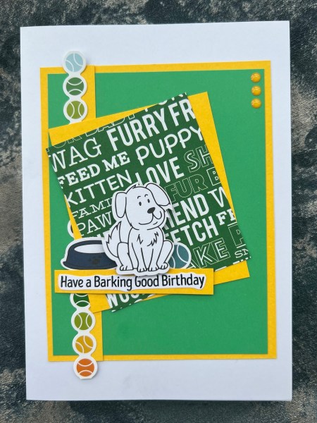
This one I kept fairly close of the original sketch – I did add in some texture to the background using the Pinewood planks embossing folder. I popped the little dog up on adhesive foam to give some dimension. The sentiment is a foiled one which I had already got made from a spellbinders Betterpress set.
I love the pops of yellow that the mat layers added to this one along with the cute die cut puppy!
This second one I did vary the sketch by turning it from landscape to portrait and also moving the strip to one side as it worked better because my paper had direction to it – Kendra does give you an indication of the direction a paper will need to be used on her guides but I forgot to check that when choosing a directional pattern!
I wish I had added a little texture to that green panel in the background on this but already stuck things into place when I thought of it! Doh!
The sentiment is embossed into the white and fussy cut. It is a stamp from Amy Favourite Things.
I love how these both came together – I am not sure I would have ever found a good use for that wordy paper as a full sheet of 12×12 – but when you cut it into smaller panels like this it works well to create a cute card!