Following on from yesterday

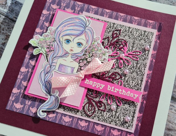
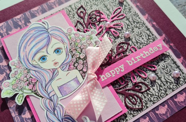
Yesterday I made a card using the idea of colouring the outline of the image once coloured in so that it had a dark background. I liked the autumnal feel one I made yesterday so I went with pinks and purples for this one but then the original idea I had of die cutting the zero waste leaf die and using that behind the image didn’t look right so ended up making a third card to use that and added the coloured background to a grungy background instead.

So this is the card I ended up with … I used a darker grey ink for the outline and background this time which is more dramatic and then black ribbon and black mat layers for the background and the sentiment.

The background was a piece of mop up on photo paper which picked up some pattern from stencil it was wiped from. I added the script stamp over it to add further interest and the gold sequins as embellishments.

It’s quite a moody card but I think the white sentiment panel and the gold embossing helps to lift it.

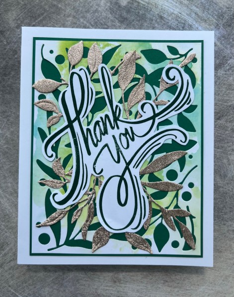
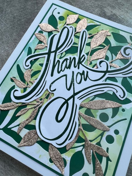
The final one is similar colours but watercoloured and kept it with the white background.

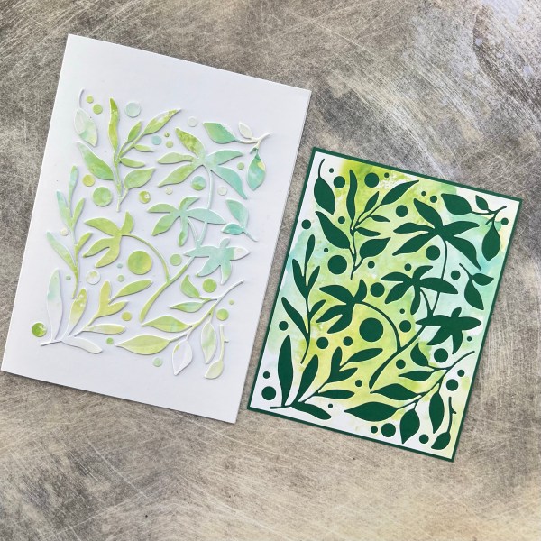
I used the zero waste leaf die and cut from another mop up on photo paper so all those leaves are glossy and I also added quite a few of the little die cut circles too.

Some of the die cuts I raised onto white die cuts and others straight onto the cardblank so they have different dimensions going on.

Love both these cards … this one is more my usual style but the dark one was what I was attempting and I think it looks cool too.

And clearly all three are very different takes on the same digital stamp and very different in style and techniques.

Also must share this pic of the companion I had for crafting! Next doors cat … Simba … who decided to sleep in our house in his fave place next to the window and the basket.

Little cutie!

Happy crafting!

Catherine

I had an idea … autumnal card

So I had an idea … it was just something I wanted to try with a digital stamp (Alex Siberia) and I ended up making three cards all at once but only sharing this one today … the other two I will blog tomorrow.

Ok here is the final card…

Super autumnal and a bit grungy and very much influenced by the style of some of Prarie Paper and Inks as I was binge watching her videos but not exactly a case of any of hers specifically…. More it was lots of inks and splatters including some shimmer!

Anyway the idea was to colour around the image before I fussy cut it out to give something other than a white edge. I printed the image four times in total (twice on each sheet of A4) and I then added inks using blending tools … turns out that this moves the printing ink so it doesn’t lend itself to lighter colours but this orange and green colour scheme it is fine.

I actually coloured the flowers on a separate image and fussy cut them out to layer onto the background and the leaves.

Then I added a smoky slate stampin up border/background. This took on the colour underneath from the blending but made it darker than the colour on the images and I think it worked well.

Next I created the background from a piece of mop up using similar colours of inks. I then splattered both the image and the background with black gesso, white gesso and the shimmer rose gold ink.

The background I then embossed it with the fern embossing folder to give it texture. I added more inking to pick up the texture and darken the edge a little.

I mounted it onto Kraft that I had inked in brown at the edge to make it darker and richer in colour.

I then heat embossed the sentiment onto Kraft with white and again added brown ink to the piece to darken it a little and make it work with the other colours.

I found this glitzy ribbon in the stash and folded it beneath the sentiment and added some strips of scrap card underneath to raise the sentiment and then added it onto the panel.

Popped it onto a 5×7 card blank and called it done.

Love how this came out … want to see a completely different take on this idea of colouring round the edge, pop back to my blog again tomorrow to see that one too.

Happy crafting!

Catherine

DT: Addicted to stamps and more #456

Hello!

Welcome to another design team contribution for Addicted to stamps and more and this time the challenge is ‘make your mark’ which basically means colour in!

So I grabbed this cute From All Of Us image and coloured it in with my promarkers before fussy cutting it out.

I decided to use lots of layers of speciality paper under the image and also a die cut wreath to frame the image.

Underneath I embossed the sentiment.

Love the contrast between the cute image, the glitter cardstock and the handmade paper with the torn edge.

Also love the embossed sentiment.

Happy crafting!

Catherine

Blues and greens – a more masculine card?

Ok so I make cards for my parents to send as well as some for my aunties and then I build up a stash that I can use too … I usually end up donating some to charity shops to sell too because I make far too many cards! But I love it. Although here is the catch … I love floral and girly looking cards more than anything … and I really don’t enjoy masculine cards very much at all. But as there are men that we all need to send cards to I have to push myself and try a more masculine card every now and then.

Now I don’t mean blue and green equals masculine… my favourite colour is blue, my daughters is green … but when the card is quite graphic like this one it becomes suitable for use for both male and female recipients. So that’s the best I can do! 😂

I grabbed the Happy Celebrations stamp set … which I love and have used often. I decided to create the background with stamping and overlapping one of the happy stamps in different blues and greens. I then splattered it with some black gesso.

I mounted it onto the Tahitian Tide cardstock and set it aside.

I then heat embossed the boxy happy stamp with black embossing powder and water coloured using the same colours of ink as the background stamping again overlapping the colours.

I waited till it was dry before fussy cutting the letters out.

I heat embossed in white the rest of the sentiment onto black and mounted it on white before adhering it to a panel of the blue to stretch across the background.

I added the letters individually to hang off the top and then added some foam behind the panel to give it dimension.

And that was that … added to the 5×7 card blank and called it done. No bling, no ribbon. So suitable for a male or a female. And a departure from my usual girly flowery cards!

Happy crafting!

Catherine

DT: Happy Little Stampers Anything Goes with Dies challenge

Hello hello hello!

Todays design team contribution for Happy Little Stampers is the card I made for my cousins daughter last month but I saved blogging it till now so that I could share it on this DT post.

I love this image that I’ve had for quite a while and decided to team it with some quite elegant papers from the stash and made a pretty pink and purple themed card.

Of course as this is a anything goes with dies theme I used some of the Splendid Stems dies to create the embellishments and a spray of flowers down one side.

I added lots of dimension on this bigger card (7×7) and some pearls and a ribbon to finish.

I’m sure Eleanor would have loved this more grown up looking card for her birthday.

Happy crafting!

Catherine

Three hanging houseplant cards

I decided to reach for the Hanging houseplant stencils and have another play with them and ended up creating four houseplants in total so made some cute sending hugs cards.

This time after inking the plants through the stencils I added some details using promarkers that colour matched with the inking. The result is very subtle but has given some more definiton to the leaves so I am pleased I tried this.

Kept the theme similar across these with Parakeet Party and Kraft with the pop of some Hello Honey cardstock too.

This one I inked up the background panel of parakeet party using three of the layered stencils to add some fun background to the two plants. I also used the Pinewood planks embossing folder for some texture.

The sentiment stamps and dies for all three came from a Lawn Fawn set.

I took another little panel and did the same inking for this as the last one using those layered dies.

This time used an old Sizzix embossing folder and inked over it lightly with the white pigment ink to make the embossing pop a little more.

This final one I used a different stencil to create a panel of images down the back using the same green inks as used for the leaves on the plants. Then I found some old patterned paper to mount them against the Kraft.

I chose a different sentiment die this time but from the same set. I then added some die cut circles from Kraft to embellish.

Enjoyed how these came together.

Happy crafting!

Catherine

Three butterfly and zero waste leaf cards

This started with me just wanting play with the Concord and 9th butterfly stencil and dies I got some time ago and really haven’t done much with … and ended up being lots of fun with leaves and pretty yellow butterflies!

In total these three cards probably took over 6 hours of work but they were made in stages. I actually had made all three backgrounds in a completely different playtime and stuck them in my backgrounds to finish off pile with no knowledge I would end up grabbing them all in one play session to play with the butterflies!

I have done posts on using the zero waste leaf die before so please check them out. These were three in one go type of things … a green mop up piece, a Kraft one and then plenty of white versions underneath for dimension. The third panel is the leftover bits from the other two.

Now onto the stars of the show … those butterflies.

This was my first set …. Soft yellows with a touch of pink added in … then die cut. Then used the same colours to ink some cardstock and that’s where the little ones got die cut along with the mat layer for the sentiment.

Stacked up lots of white butterfly die cuts under the inked version for dimension.

Then loads of tiny pearls into the space around the leaves for embellishment.

I love that soft background with the subtly patterned butterflies.

Next up this Kraft quite bold background onto white. This time used the patterned dies and also die cut the bodies for the three main butterflies from the Kraft to coordinate them with the background.

Again stacked the die cuts for dimension and also raised the centre of the sentiment too.

Just three pearls for embellishment that I added some peach alcohol ink to so they coordinated.

And finally this was a really busy background with both the green and the Kraft.

So it needed bolder butterflies. In addition to the stencilling I added gold wink of Stella to some of the pattern which gave depth of colour and some sparkle.

I didn’t bother adding die cuts under the butterflies … I figured this had enough going on to not need the additional dimension to them… I did however add a little foam under the sentiment strip.

As the background had both glittery circles and glossy circles I didn’t add any more embellishment.

Love all three of these cards and really surprised myself as I wasn’t expecting this was what would happen when I sat down to play with the stencil. It has however cemented my belief that having backgrounds ready to go is super helpful when making cards … so need to make sure I routinely sit and just create backgrounds so I can easily get a card made that is extra special like these without 6 hours worth of work all in one go!

Happy crafting!

Catherine

Using very old gifted stash

Many years ago I was gifted a laser cut sheet of wreath type images and it’s sat in the stash … well I finally decided to use it.

Yes I went this overboard and used almost all of it on one card … just the middle section unused … but I made this 8×8 card for my auntie and so I think she deserved all the layers and elements.

I started by die cutting a few circles of the tidings and trimmings dsp so that I could layer up the middle section with some dimension.

Then I glued the laser cut elements into place.

The outer striped panel was from a different dsp set but the colours worked with the other paper so I think it is fine … albeit it is very busy!

I decided to go with the Tim Holtz dies for the sentiment as it needed something big and bold and then the Peace and Joy for the “and” to finish off.

Odd for me to not add gems to a card but I think I had already thrown the kitchen sink at it and so pleased to have finally used the laser cut elements.

Happy crafting!

Catherine

Zero waste leaf die panel

A few weeks ago I made use of the zero waste leaf die cut shapes but never got round to finishing up with the actual background I created.

Here is the starting point once I had adhered it to the green cardstock. The other card I finished up has already been on the blog.

I decided to stamp the large Stampendous thank you and cut it out so that could be the top element. Next I used the die to die cut some rose gold speciality paper to add some embellishment.

I poked these all under the sentiment and then called it done!

Love how it looks.

Happy crafting!

Catherine

Inky scraps and embossing die cuts

Hello! Thanks for popping along to my little bit of the internet. Today I have a fairly simple card I made.

I used a scrap of mixed media cardstock and smooshed some distress oxides onto it using different greens (including my favourite Twisted Citron).

I added this down the centre of the card blank (it’s a 5×7 card blank) and then started grabbing some bits and pieces to add to it.

I started with the piece of white embossed cardstock and then I grabbed the Happy Birthday die cut that I had actually cut for another project and not ended up using. I didn’t want the black that it was cut from however so I added two coats of the pearlescent embossing powder which gave it a lovely texture and finish.

I added this at an angle across the embossed piece and then looked for an image I could use to finish off.

I decided that this cute little Altenew flower piece was perfect for the job and offered a nice contrast in colour with the coral/brown colour.

I then added some light green card Candi as embellishment.

So quite a simple and yet a bit arty with some texture and shine.

Happy crafting!

Catherine