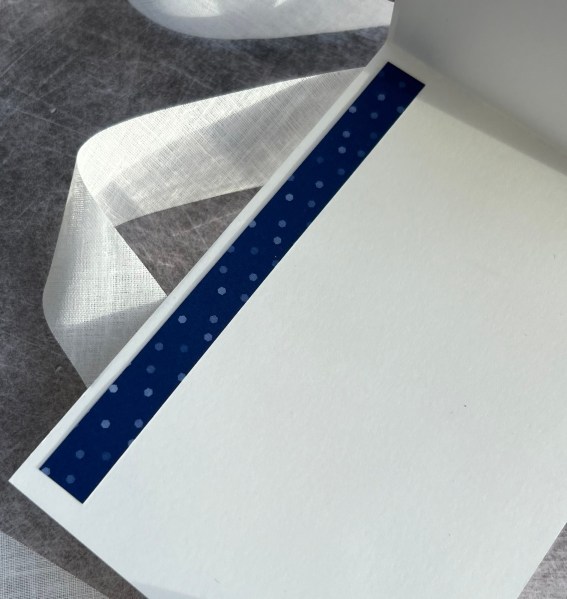
Todays card is carrying on with the stash I used for last weeks cards… I had stamped and watercoloured one more of the floral images and then I grabbed leftover paper strips and a piece of the cream cardstock leftover from the previous cards and made this…
Strips of the patterned paper added and then the floral element connecting them with the sentiment on the background …
Such an easy card to put together and just added the card Candi and some doodled stitches to finish off. Mounted it on black for the frame and then onto a card blank cut to fit.
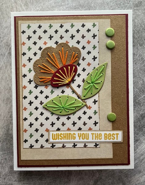
This card I made ages ago but never got round to sharing … better now than never!
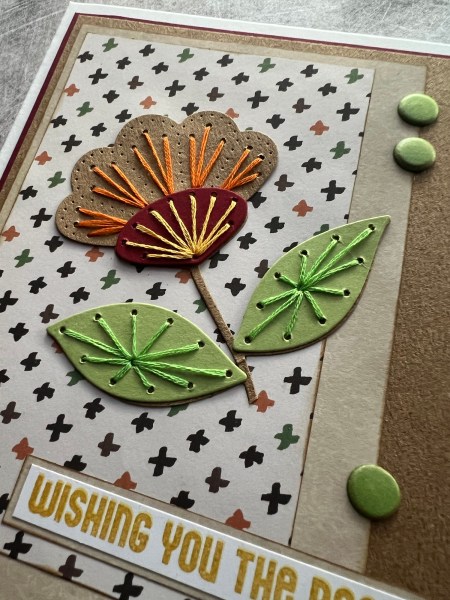
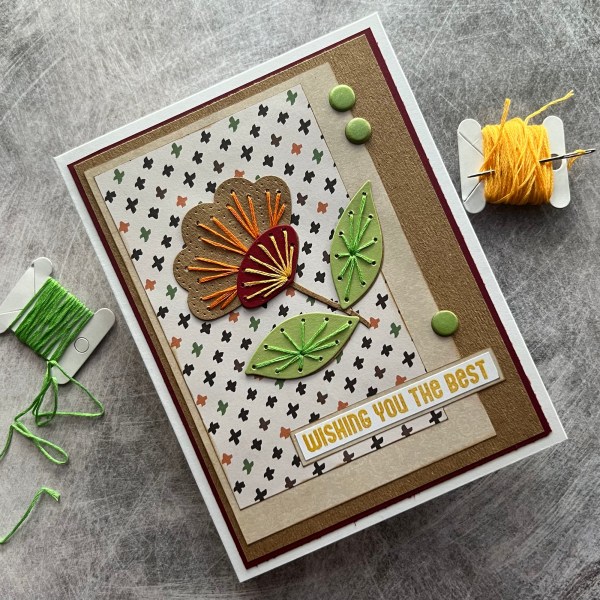
It’s one of those stitched flowers I have had in the pouch of ready stitched elements and on the day I put this together I was in a use patterned paper kind of moods! So I grabbed papers I thought worked ok together and worked with the colours in the flower I had stitched. I actually trimmed this flower as didn’t want the stem to be as long.
I added ink to the edges of each of the panels of paper to give them a frame and stuck them down. No dimension just flat with the inked edge worked fine.
I added the Kraft back panel to tie in the colour of the flower and the stem.
I added the sentiment which I stamped in the Hello Honey colour as I thought that worked well with all the elements in the card.
I trimmed down the card blank so it’s about 6×5 rather than the usual size of 7×5 as that worked better with how the layers looked.
Finishing touch was to add those three card candi on the edge of the middle panel of patterned paper … this pulled out the green of the leaves and from the patterned paper.
Cute card and quite different from the other cards I have made with these stitched flower dies.
Today I have the second of the cards I made from the masterboard piece I shared on the first of April.
Again I die cut a panel using the scalloped die from the December spellbinders die set. This time I teamed it with the wreath from the Natures Prints set and the sentiment stamp and label from the same set. I also added the die cut dragonfly to the centre of the circle.
I again added pearls as final embellishments.
Love this shabby chic background and the pretty way this came together.
I did stack up a couple of extra panels of the scalloped panel so that there is quite a lot of dimension on the card but otherwise kept the card blank clean so that the texture and fun on the main element took centre stage!
I used up some old dsp papers that were on the desk for the background and a piece of die cut that I had cut off a project I made a few months ago for a Christmas card…. This is why I never throw things away – you never know when they will be the perfect little extra element.
I added the sentiment and then some card Candi to finish off the front of the card.
I love how this looked … I added just a little bit of the dsp to the inside to make it link to the front.
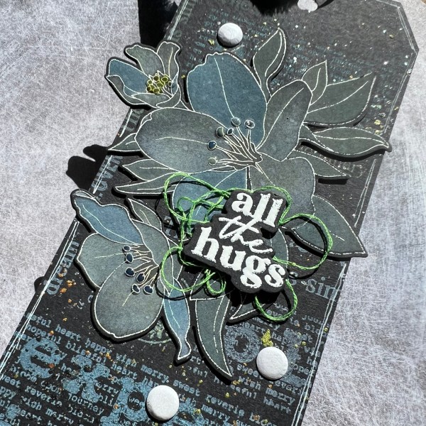
I decided to join in with the UK stampers forum swap again this month as I made a background as an experiment and wasn’t entirely sure what to do with it … so a tag was made.
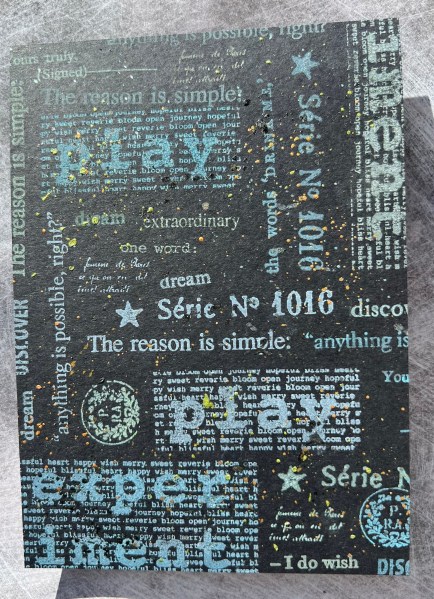
I am still going through my stash and trying to get rid of things I don’t use and this Paperartsy stamp set is one I like a lot but never really use now I don’t really do art journalling stuff … so I decided to have a play with the stamps and see if I could make something with them before I listed them for sale.
I took some black cardstock and stamped the stamps using white pigment ink and then went over them with the distress oxides in different colours. This gave a colourful but subtle colour to the whole piece.
Then I sorted through my Art Alchemy paints and did lots of splattering. Unfortunately these paints were quite dry so I had to water them down to reactivate a little and then have had to accept defeat on these and get rid! Such a shame but it’s my fault for not using them more often.
Once the paint was dry I trimmed down the panel into a tag shape and had to decide how to finish off … well of course my stamp set of the moment (Altenew Splendid Bouquet) begged to be used … this time with white embossing the stamp image and then blending using the mix of white pigment and distress oxides.
I die cut it out twice to stack it and give it some strength as I knew it would hang over the edge. I also spritzed it with water to activate the oxides a little.
I added the sentiment from Waffleflower again stacked up for dimension with the thread sandwiched between the sentiment and the image and then added some white card Candi for embellishment.
I added some glossy accents to the stamen on the flowers too.
I chose three bits of blue and green ribbon from the stash to add to the top of the tag and then decided it needed something to finish off … white posca doodled outline did the job perfectly!
I do still really like these stamps but they have gone for sale as unlikely to use them often. I do still have a strip of the background left so will have to do something with that soon and share it … but for now it’s still sat on the desk awaiting inspiration to strike!
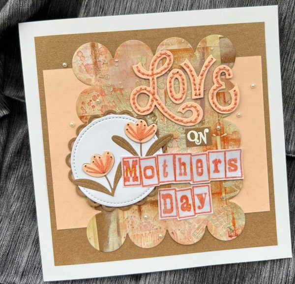
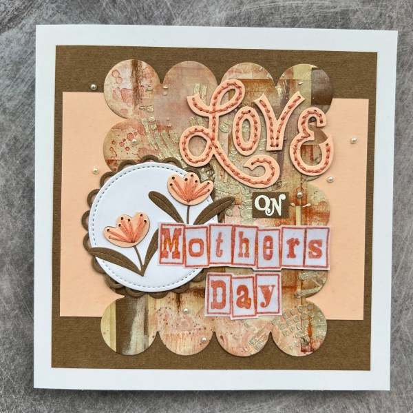
Today I have my usual use up the patterned paper challenge and this time I went for a masterboard using the Crafters Companion papers that a friend gifted me last year.
Lots of pieces of the papers on to some white cardstock and then some Kraft pieces mixed in. Added some stamping with Gorgeous Grunge and then added inks using my distress inks. Next up I added the iridescent texture paste through a stencil. I also splattered the shimmer ink too.
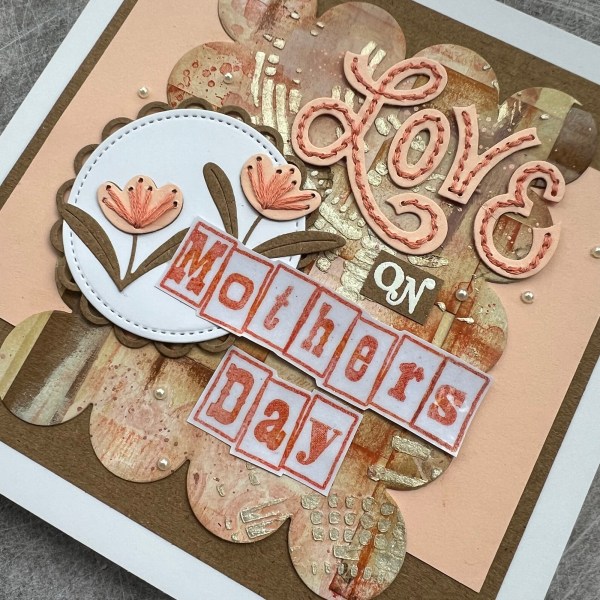
From this I made two cards … firstly the Mother’s Day card I made for my Mum and then a second card as a best wishes card.
I decided to create cards using the Stitching dies from the December kit from Spellbinders so once it was dry I die cut the two big scalloped panels from the masterboard.
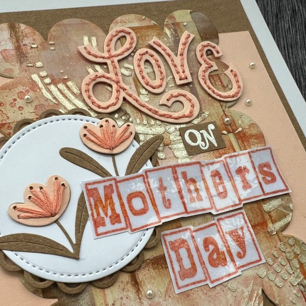
I started with the Mother’s Day card first. I decided to add extra ink to the background to darken it up a little. Then I set it aside and worked on the embellishments for both cards … the stitched flowers. After die cutting them from Kraft for the leaves and petal pink for the flowers I grabbed my peach thread and started sewing.
Then I die cut the Love letters from the kit and stitched them too.
I then die cut some circles and the scalloped circle for the two larger flowers to sit on and then started adding elements to the card topper starting with the 6×6 Kraft base to go onto the 7×7 card blank.
I added a few layers of cardstock and the main scalloped element and then decided to use the Claritystamps letter stamps to create the rest of the sentiment (the ON is from a different claritystamps set) which after stamping I embossed to make it shiny and then fussy cut.
I added some pearls then around the card and called the front done!
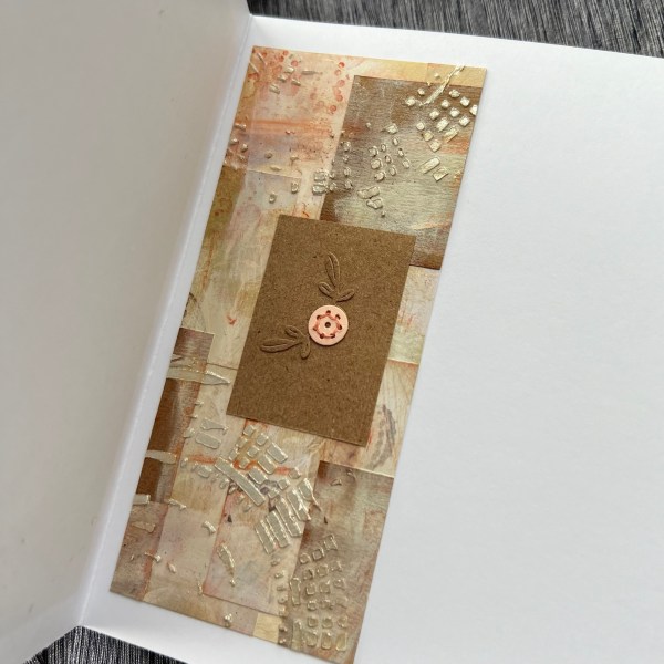
The inside I added another panel which I had just cut and inked in a similar way, plus a piece of Kraft and one more flower image.
Given this is quite a long post already I will share the other card I made in a separate post. Please pop back to see that in a couple of days (DT post coming tomorrow).
I made these two cards for my aunties as their Easter cards, but then our plans took a turn as the whole house has been poorly with a bad cold so they didn’t get posted in time to teach them for Easter but they should receive them next week instead! Better late than never I suppose!
For both I chose the patterned paper that I think was called Sycamore Street or something like that. It’s been on my desk for a while waiting to be used up after I used some for a scrapbook page I made … and the colours of those ‘&’ made me think vintage Easter so I went with it!
I started by embossing the wreath from Arrange a Wreath with a gold colour over the top of Distress oxide walnut stain – this gave it more of the vintage look than a bright gold.
Then I added speckled egg and the walnut stain onto the background more randomly so it is very vintage looking.
I did both backgrounds at the same time but one piece of paper was slightly larger than the other and so the positioning was slightly different for both cards.
I mounted the background onto the green cardstock for both which adds a little pop of extra colour.
Then I took the egg stamps from the set and stamped them six times on the leftover patterned paper – fossilized amber, worn lipstick and cracked pistachio. I then die cut them all out.
I then stamped the box image in speckled egg but decided it wasn’t quite bright enough so went over it with the cracked pistachio. I fussy cut out the box and edged it with the walnut stain.
I arranged the eggs in the box with one at the front of the box and stuck them together and added a piece of foam behind to add dimension.
Next I stamped and fussy cut the sentiment. I added some gold thread behind the sentiment and stuck it down onto the box.
So quite a fun pair of easter cards and a bit different for me in terms of going vintage … maybe watching Tim Holtz has worn off on me!
I went on a bit of a journey watching Amy from Prarie Paper and Ink last night on YouTube whilst I made tea and then afterwards I decided to join in with the Color Throwdown challenge this week … admittedly the videos I watched weren’t for this challenge but it reminded me about the challenge itself and so went to find out the colours for this week…
How delicious do those doughnuts look?
Anyway I grabbed some scrap paper I had wiped up some distress inks with and it was a creamy pink so perfect starting point! I then decided to have a hunt through old stash to have a play with something a bit different and came up with the Visible Image stamp set with these butterflies and text clusters and made my panel using Distress inks in Vintage photo and Picked Raspberry.
I added a border of the Kraft cardstock and then using the same Kraft I decided to die cut these tiny butterflies using an embosslit i have had in my stash forever! I think it might have even been the first thing I bought when I got my first die cutting machine!
It embosses the butterflies as it cuts them!
I added those and then decided they needed shimmer so coated them in wink of Stella and also added some ‘puddles’ of the shimmer onto the background too. They should have been splatters but I got a little heavy handed!
Next I stamped the sentiment using the Altenew Splendid Bouquet bundle and die cut and stacked it up three times.
I added a scrap of the pink ribbon at the top of the topper panel and then stacked that a few layers too so it had dimension off the slimline card I chose to add the panel to.
Pleased with my cream, brown and pink card and also pleased I used some really old stash for the first time in ages!
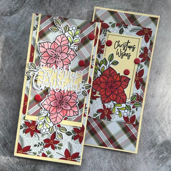
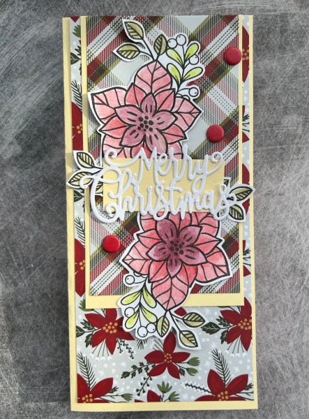
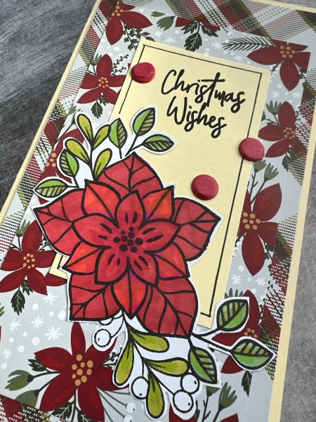
I made two slimline cards using up some dsp that I was gifted some time ago.
The plaid and the poinsettia patterns made me grab this magazine stamp that I’ve used many times to use as the focal point.
I decided for the first card to add two flowers underneath the sentiment that was a die cut and coloured them using the Derwent Inktense pencils.
I didn’t do a brilliant job of colouring because the paper wouldn’t stand up to lots of water but they blended enough for me to just go with the flow and use them!
I used the die cut from Tonic and added some layers of the cream to go with the card base.
The second card I coloured using promarkers. I don’t have a great selection of greens or reds so ended up with some interesting tones to the flower but again it worked well enough that I could use the image on the card.
This time I stamped the sentiment onto the cream and added a hand drawn border so the black line art was in keeping with the panel.
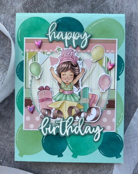
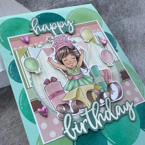
Today’s blog is another Design team contribution for Creative Knockouts where the challenge is Birthday Wishes. Now as I make a lot of birthday cards this really doesn’t count as a challenge!
However we were gifted this image from The Paper Shelter and as it came as a pre coloured image, black and white image and a background panel coloured my challenge was how to use it!
The excellent news was as it is so cute you don’t need to do much – especially if you decide your colouring couldn’t possibly be better than the pre coloured version!
So I printed out the background and the image in colour. Cut out the image including the three free floating balloons and added them to the background with a bit of dimension using pinflair glue gel. I also added gold thread to the balloons and some wink of Stella to both the balloons and gifts to give them a touch of sparkle.
I decided to add to the balloon theme using the waffle flower balloon builder stencils on the background card panel. I used teal and green ink for this to keep in with the colours on the image and background.
I also added little white highlights to the balloons to keep them looking dimensional.
I finished off the card with the heat embossed sentiment which I fussy cut and the pink puffy sticker hearts I found in the stash which I thought went well with the cutesy image!