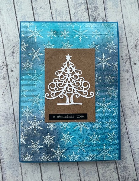
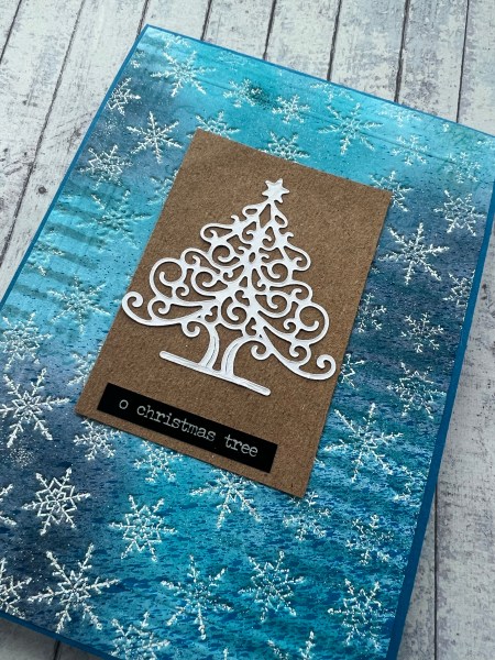
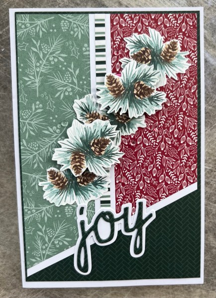
Can’t promise I won’t do another one of these but this is like yesterdays before you get bored of the same technique … a background that I embossed the debossed part using the embossing folder upside down!
This time the background I used a scrap of the sprayed leftover paper from my daughters photography project way back at the start of the year and inked it up with blending brushes. I then also added some stencilling. Next I embossed it upside down with versamark on the raised elements so this pushes the versamark into the indentations so that it where the embossing powder gets caught.
This time I used the white sparkly embossing powder so it is sparkly but because the embossing is quite fine it isn’t over the top! Next I used my scoreboard to add a frame … to be honest it is quite subtle so unlikely you will see it well in the pictures.
I then used a scrap of Kraft, a die cut I was gifted and a Tim Holtz sticker to finish off and the card blank is Pacific Point so a nice bright blue colour.
Rare for me but no gems or extra embellishments … so quite a flat card but that background looks like so much effort went into it but really it took just a couple of mins!
The bad part about this technique is being careful not to tip over the embossing powder pot as it goes everywhere when you do … how do I know that? Well you can probably imagine!
I know I’ve shared Jennifer McGuire’s embossing video a few times now but really this technique really steps up a background!
I used it here on a spray ink background but then blended inks over the top to completely change it up. I used a blue embossing powder and an intricate embossing folder for this one and it turned it into a lovely rich looking background like old fashioned wallpaper.
In this picture you can see some of the shine and texture better.
Decided to use it with this panel of stamped baubles and Kraft for a funky look. I love this tonic sentiment die too for really finishing a project off well.
I also added tiny pearls to the centre of the baubles to make them special.
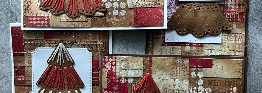
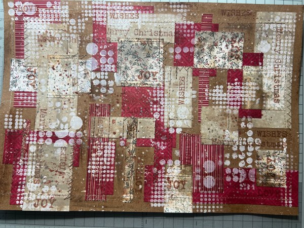
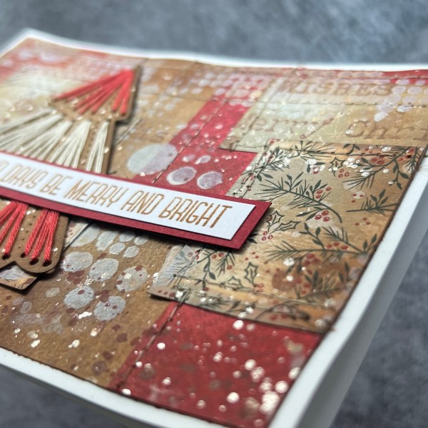
So a few weeks ago I had lots of fun watching the Tim Holtz Holiday Hoopla videos on YouTube and it got me feeling vintage and mixed media! This is what I then created whilst watching the video!
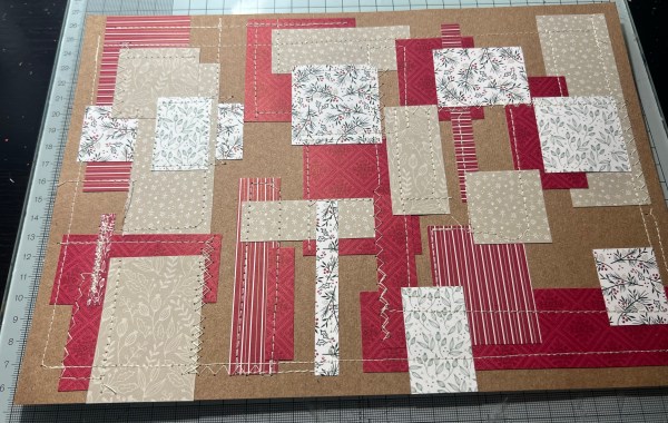
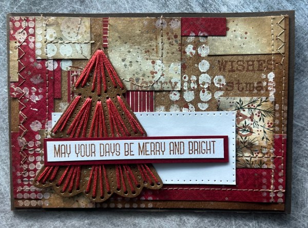
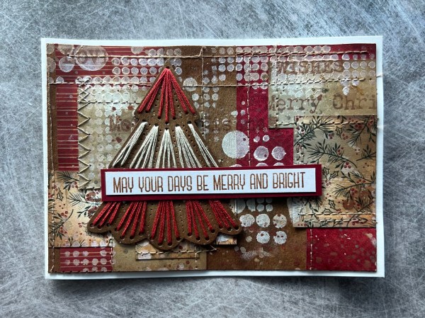
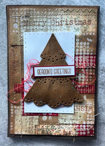
I ended up with four cards but cut from the one masterboard I made. Here are the progress shots …
I started by taking pieces of the Tidings and Trimmings papers and cutting them into random rectangles and shapes and just gluing them down with a little bit of glue stick … I wasn’t concerned about gluing them flat as I knew I wanted to sew over them.
I then did lots and lots of sewing. Sometimes I followed the shapes of the paper and sometimes just sewed straight across sections. I didn’t really think much about choice of design but occasionally changed the setting to zig zag rather than straight stitching.
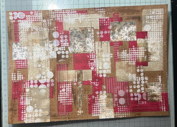
Next I added three different colours of distress ink (all browns) by swiping the ink pads across the masterboard so it was random but caught all the texture in particular. I then used a blending brush to wipe across it all to soften some of the lines.
I then took a stencil and using white gesso added the stencilling randomly all over the page. This unified the page giving it some interest but consistency.
Next up I added word stamping using archival ink to add something more suited to Christmas cards.
Next I took three different acrylic paints and heavily splattered all over the whole sheet. One of these was a gold shimmer paint so it is super sparkly when you see it in the light…
I then chopped the panel into four pieces and trimmed them down slightly so they were 14.4cm x 10cm so they would fit on a standard card blank with a border.
I then used both the Vintage photo distress ink and some Early Espresso to ink the edge to frame each panel. I decided at this point that two would work well as portrait cards and two as landscape.
Next I took the same Kraft cardstock and die cut the spellbinders stitched die tree from the October kit and die cut that four times (I actually did it six times in total but two just were to mount one of these onto so not pictured)… and then added ink to them using both the vintage photo and early espresso to give them some depth and then splattered the shimmer gold paint on them too … in my defence I have been watching a lot of Prairie Paper and Ink too and splatter is very present for her cards too!
Then I took three of the trees and did sewing! So fun to do this whilst still watching Tim doing his thing on YouTube and inspiring me with all his amazing ideas!
I did sewing on three and the final tree I left it without the sewing and stacked it three times to make it a chunky embellishment. I did add thread though just as a nest beneath the tree.
I chose to add some white panels to three cards … two I pierced manually with the piercing tool and template and the other is a die cut shape.
Then I stamped cut and layered the sentiments to finish off.
Clearly these are very different Christmas cards and I know the people who will appreciate them most are my more crafty friends who will definitely love the artsy mixed media nature of the cards … I absolutely loved the couple of hours I spent making these and think I need to do more things like this routinely as it gets me out of the comfort zone especially when dealing with patterned paper!
Also those trees are just amazing! And such fun to stitch! And I love all the sparkle!
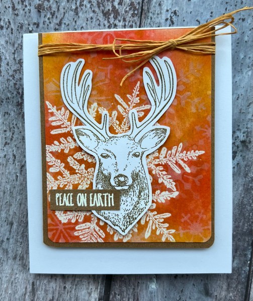
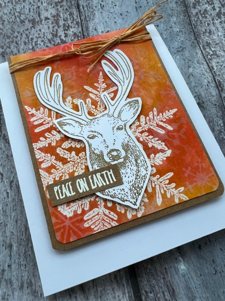
I made the background for this card months ago as part of Christmas in July but never got round to finishing it at the time. But finally I got round to finishing it.
So the background was made using distress stains and the Snow Crystal embossed for an embossed resist background. Then I added more distress stain as I wasn’t keen on the dry piece and then I added even more with some stencilling and white pigment ink. Then I liked the background a whole lot more!
I trimmed down the background. Mounted it onto Kraft and rounded the corners on the bottom.
I found some paper ribbon and wrapped that round the top and added the bow.
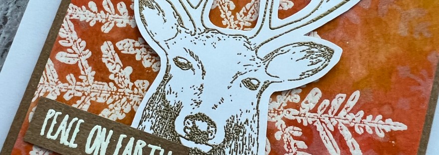
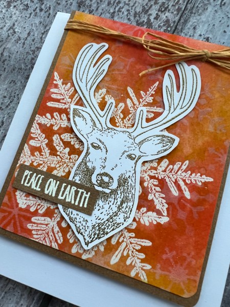
The focal point then was the fabulous stag which is a very old magazine stamp that I adore.
I embossed him in gold and fussy cut him out.
I did raise him up on some scraps of the same cardstock to give him dimension and then added the white embossed sentiment onto Kraft.
Love how this came out. I did end up making an odd shaped card which is 5×6 but it fits ok in the 5×7 envelope.
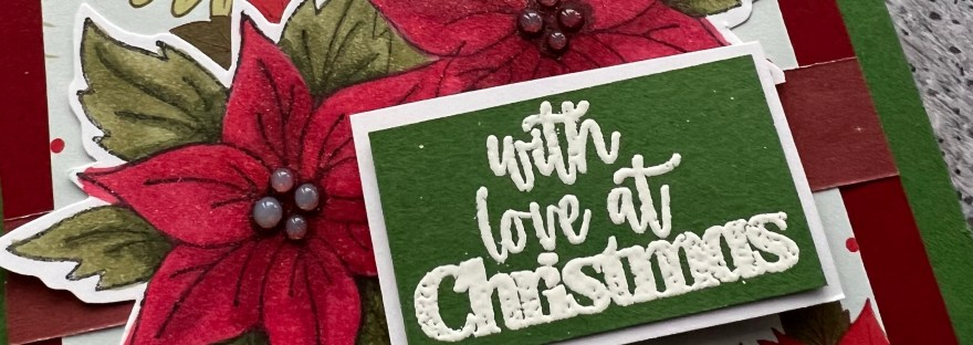
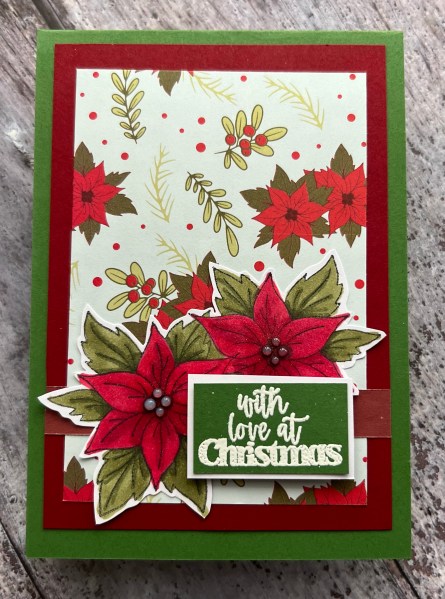
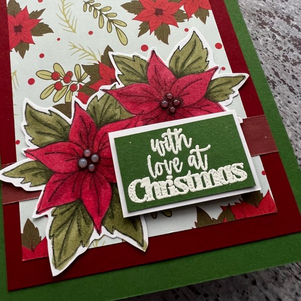
I made this card using some leftover patterned paper from a magazine kit and the stamps were from the same kit as I wanted to keep it pretty simple and traditional.
I stamped the flowers in memento ink and then coloured them using my stampin blends markers. I then heat embossed the sentiment using white powder.
I decided once I had stuck the card together that the flowers needed some sparkle so added wink of Stella to the flowers and some glossy accents for the centre of the flowers to give some dimension and of course the gloss!
Love how this came out. Beautiful floral image and quite pleased with my colouring.
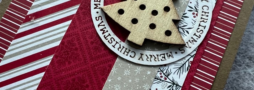
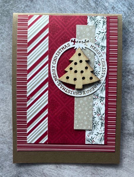
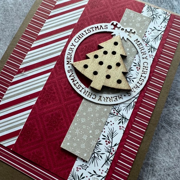
I am still in the process of clearing up my desk and coming across bits of patterned paper I can’t quite bear to part with so I turn them into a card. This one I teamed with a wooden embellishment and a laser cut piece leftover from some very old stash!
Kept it pretty simple and on the lovely soft suede card stock as the card blank.
Hoping to get more crafting in today but first coffee!
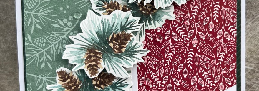
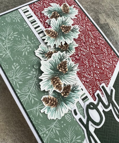
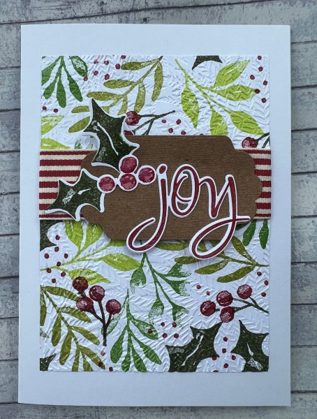
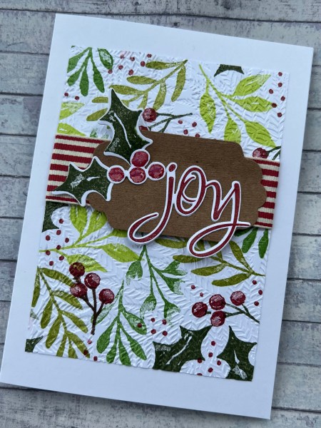
I started with a sheet of white cardstock and added stamping using the Christmas Season stamp set and different shades of green and Cherry cobbler. I then embossed this using the Fern folder which gave it beautiful texture.
Next I die cut the holly leaves and berries and the label panel to act as the focal point and then the Joy stamped word using the Colorado Stamps. I doubled up the word so it was a little more sturdy and then glued this all together as a focal point.
I then grabbed a piece of the wide cherry cobbler ribbon and added that to the panel before adding the focal cluster.
It’s difficult to see in the picture but I also added glossy accents to the berries to give them dimension and shine.
Added it to a 5×7 card and decided this was enough! What do you think?
Unfortunately though this is the last month of HLS as Kylie who has steered this ship for so long is having to rest the challenge blogs at the moment. I really hope that she only rests them but totally understand her need to do so. Hope you’ve enjoyed my contributions as much as I’ve enjoyed making them.
So this card came about because I found on my desk some scraps of patterned paper that I had previously put together as a card topper but never finished off with a focal image or a sentiment … and so I grabbed a preprinted digital stamp and coloured that in to add to the front of the card. Simple!
I added some glossy accents to the decorations on the tree and then added the stamped sentiment from Altenew and called this done!
I was a little on the rushed side for this DT as I forgot all about it! So popped this one together this morning (thankful I had the day off work) for the Creative Knockouts blog.
Will come back and edit the blog soon so I can tell you all about it but first I’m off out for lunch with my friend!
Some time later
Update … firstly lunch was lovely 🎄secobdly about this card …
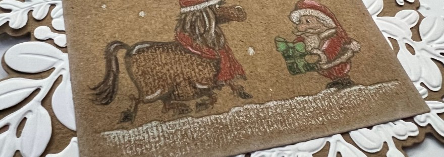
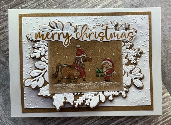
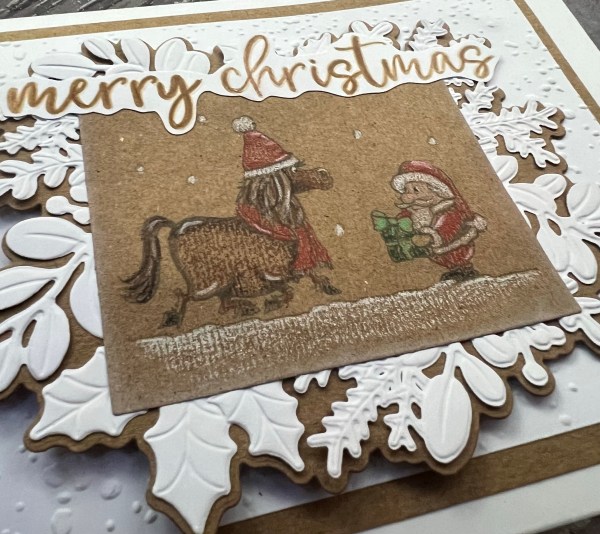
I printed the image I received from Hetty Clare onto Kraft and then die cut it out … I actually printed and die cut it four times so there are three others sitting in my stash now to be used!
Then I used my Prismacolour pencils to add colour to the image. I kept the colouring quite simple mainly as they are quite small images and they didn’t need much!
I did add wink of Stella to the snow falling and the ground to make it slightly shimmer but that doesn’t really come across on the pictures.
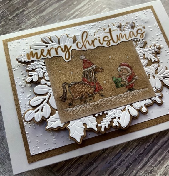
I edged the die cut rectangle with a little white Kraft ink … not much … but it was enough to soften the edge of the panel. Then I had fun grabbing the merriest moments embossing folder and die set to create the panels underneath. I decided to then go with a panel of white embossed snow and the mat of the Kraft to finish off the card topper as it needed the additional frame I thought to ground the images.
I then chose the sentiment from More Wishes and stamped that and fussy cut and added a little bit of pencil to tone it in with the coloured image.
Definitely a little different to colour in on Kraft a digital image for me … need more practice with my prismacolors but think I did an ok job. Especially given I had forgetten entirely about this DT contribution! Ooops!