

Last night I had fun crafting along with my friends using the True Love dsp.
The plan for this session was to enjoy colouring in some images and then assembling the cards around these images as the True Love dsp is perfect for fussy cutting and for colouring in with the black and white floral images. The plan was also for us to make six cards but we only managed 3 so will be having another session next Thursday to do the other three.
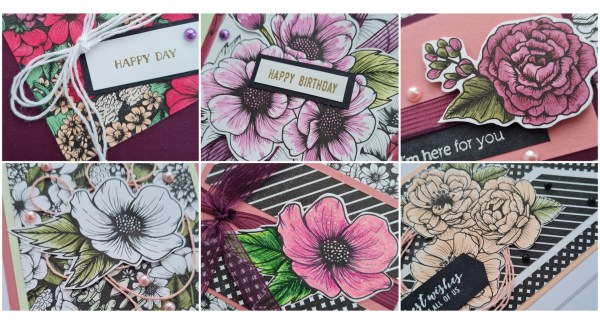
Here are the samples I made.
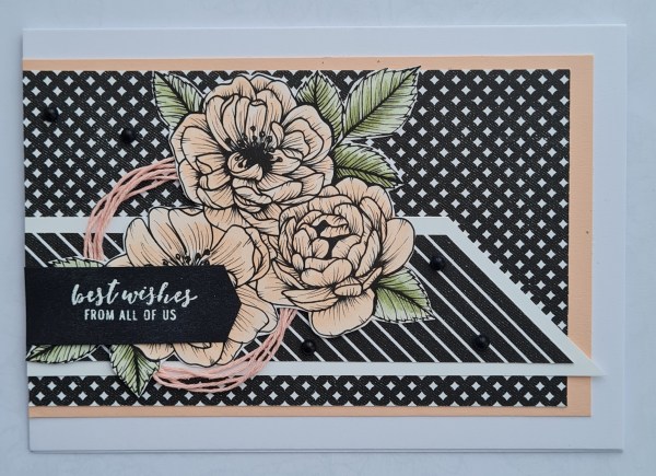
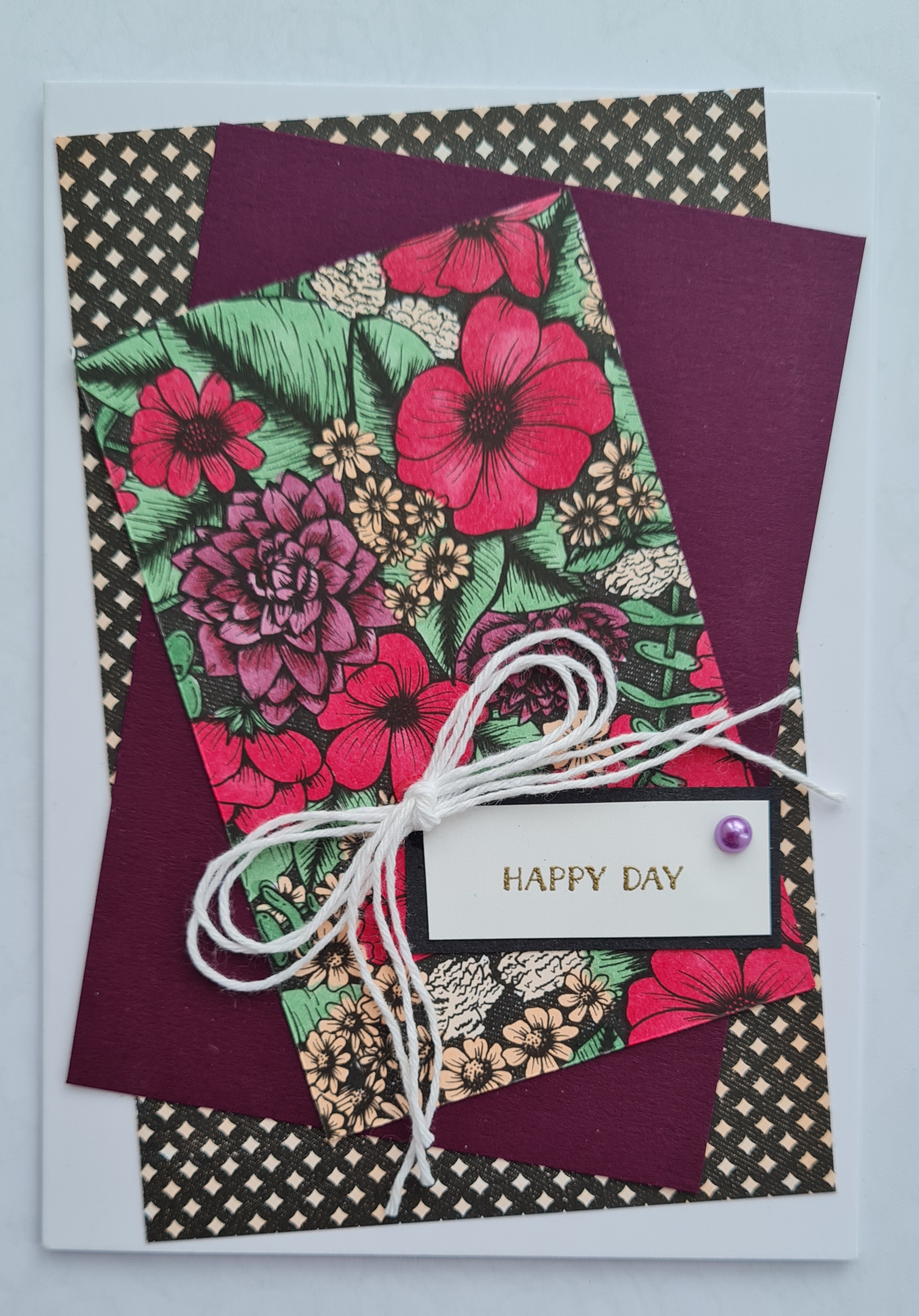
The first card is quite dramatic with the stripes and diamond patterned paper that is the reverse to the floral and is balanced by the large flower cluster. I chose the lovely Petal pink colour for colouring in and using as the accent colour with the twine and cardstock. I used Stampin Blends to colour this one. I chose to use Itty Bitty Greetings on all my cards as sentiments, either embossing in white on black or gold on white. I also embellished with black matt dots for this card.
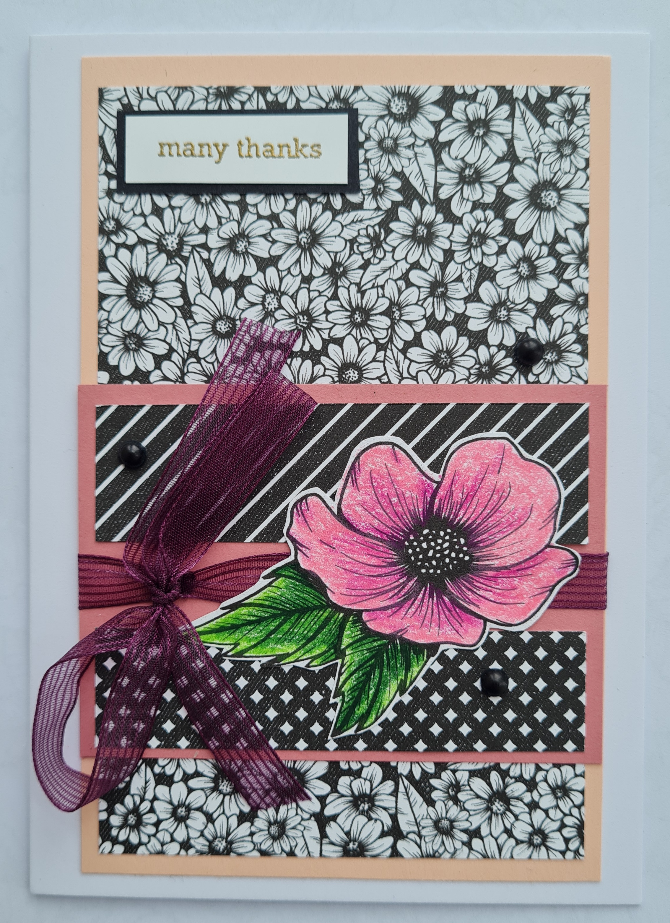
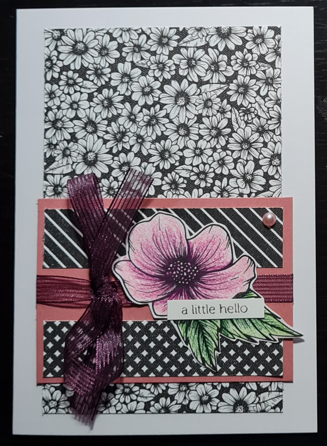
Next card is a very busy daisy like background with little strips of the reverse patterns. This time I chose prismacolour pencils to colour in the image. I added the Blackberry Bliss ribbon and a nice bow to finish this one off. The colours on the pic have come out a little strange as the flower is less neon in real life but even so I love this card with the contrasts.
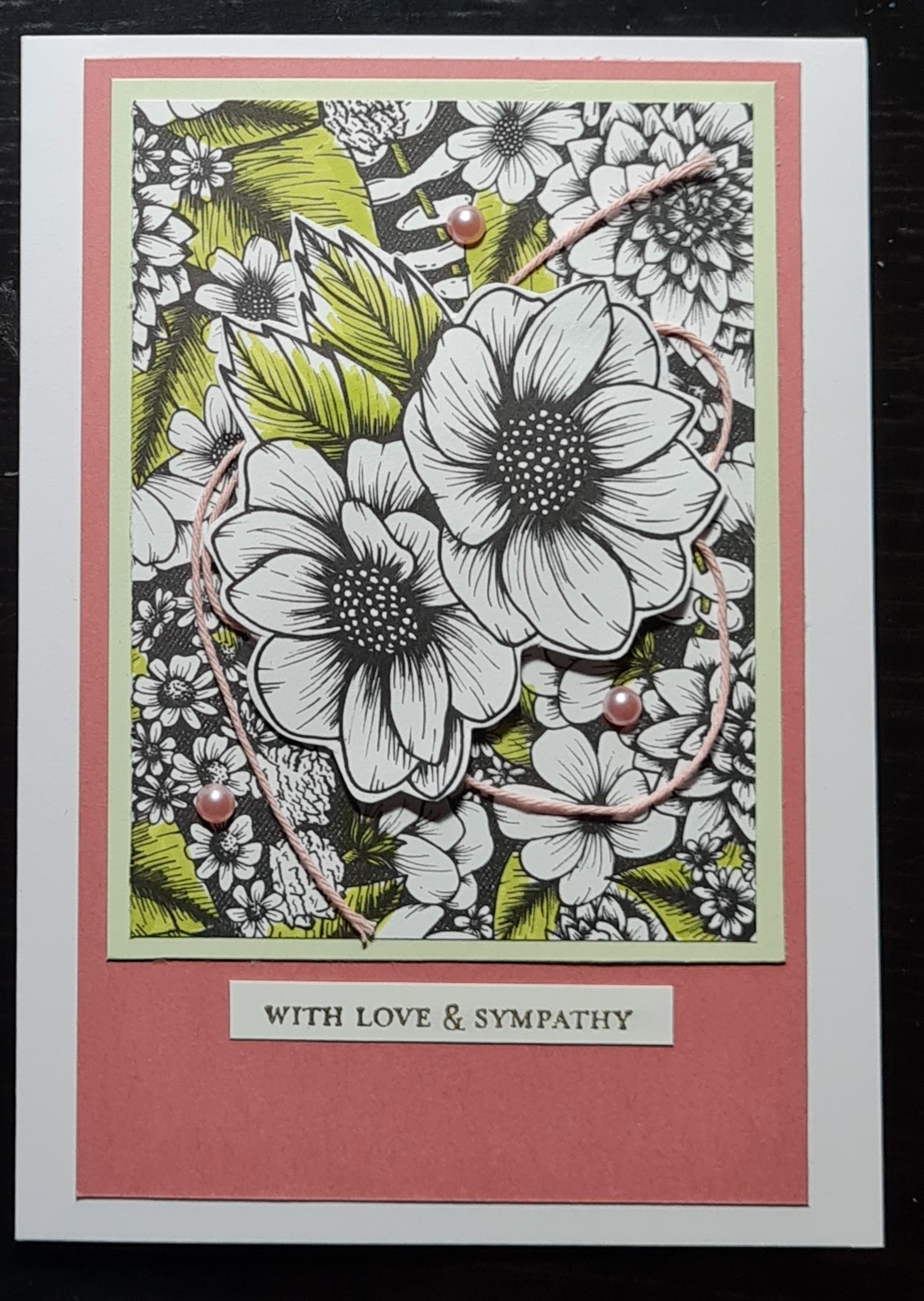
This one is more subtle than the previous that’s for certain… a small image from the same paper as the background fussy cut and coloured (Stampin Blends) makes a nice embellishment and I raised it on dimensional to sit above the ribbon that wraps the card. This time I chose the Pastel Pearl’s for embellishment.
Entering this in for the challenge at GET CREATIVE
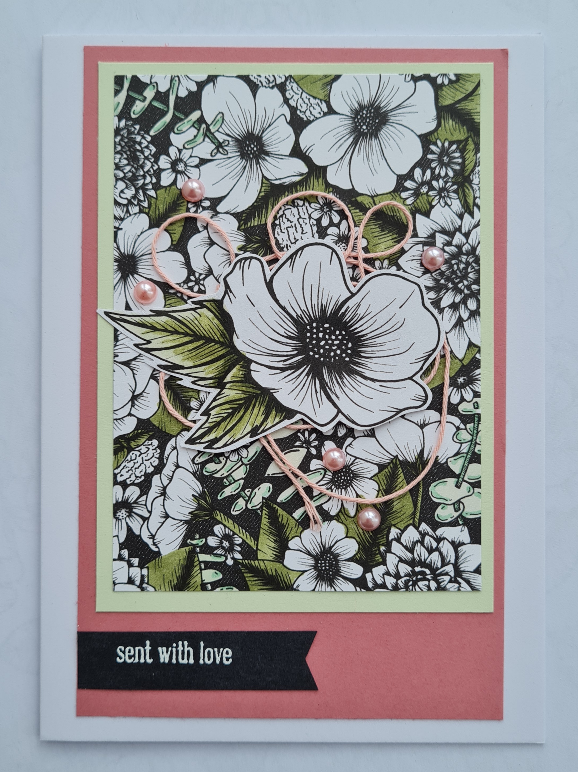
I love this next card… possibly one of my favourites from the set. This time I chose to only colour the green elements and leave the rest white and black. I then chose a similar looking flower from one of the papers and fussy cut that, again only colouring in the leaves. I added the twine for embellishment under the flower and mounted the panel on soft sea foam and then the Rococo Rose. I added the sentiment as a banner and the pastel pearls for further embellishment.

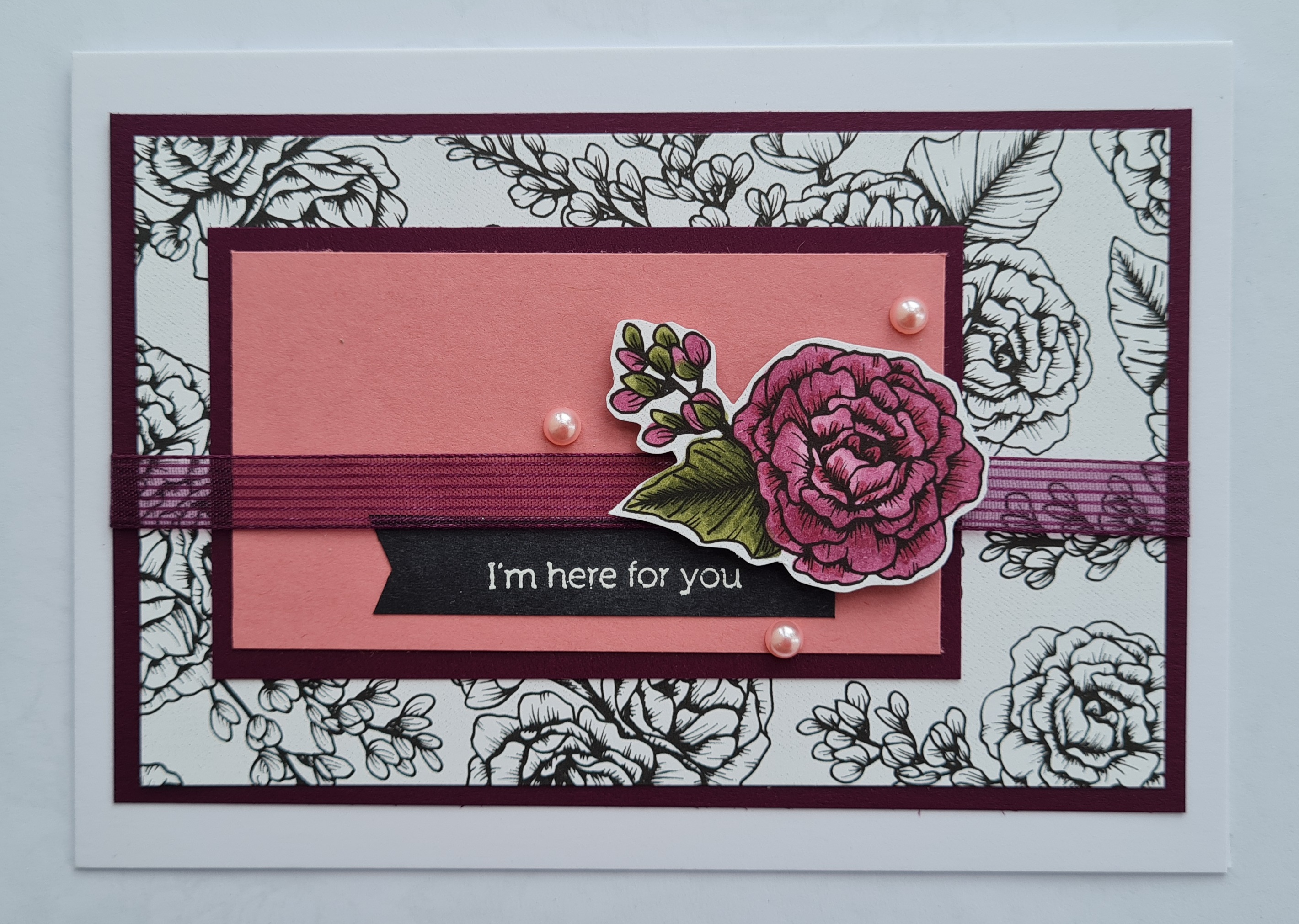
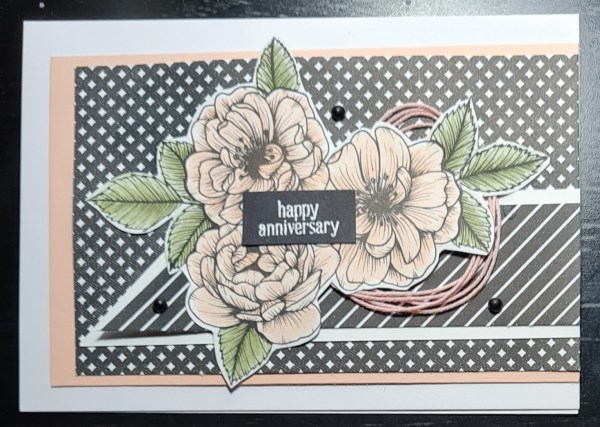
OK I know I said the one above was my favourite… but this is the one that it competes with as most favourite! Terrible English I know, sorry about that! This time I fussy cut the floral element I wanted to colour and used a waterbrush and the Blackberry Bliss ink pad to add some colour to the flowers in the centres and the Old Olive for the leaves/ stem.
I then chose the same paper as a panel but gave it a hand drawn border with with Stampin Blends and panel of soft seam foam for underneath. I laid them wonky and added a twist of the ribbon under the floral focal feature. I added the sentiment right in the middle and embellished with the pearls.
Really can’t decide which I prefer out of those two.
Finally this one I went mad with colouring in. This paper was so busy but I thought a small piece of it fully coloured in would be fun… I used stampin blends in cherry cobbler, blackberry bliss, petal pink and just jade to colour it in and it looks so rich… just love it.
The bottom piece of dsp I also added the petal pink colour … a reminder that all dsp can be coloured in not just the image based ones!
This time some simple white twine and a single pastel pearl did the job to finish off. This is a very different card… but fabulous in its own right!
Love this set of floral cards with the dramatic black and white and the beautiful colours of Petal Pink, Rococo Rose, Blackberry Bliss and Soft Sea Foam… a lovely combo.
Also really enjoyed the colouring in time… so relaxing!
The kit I put together had lots of leftovers after these projects… so look out for more projects using them up… not just the little tag I shared yesterday! Plus of course these are the samples I made… I did slightly change them on the evening for these three versions…
Happy crafting!
Catherine
