I am an on-the-side and increasingly up front papercrafter who loves nothing more than getting inky and creating pretty things with paper and stamps!
I am also a wife to lovely hubby and mummy to a wonderful 14yr old princess.
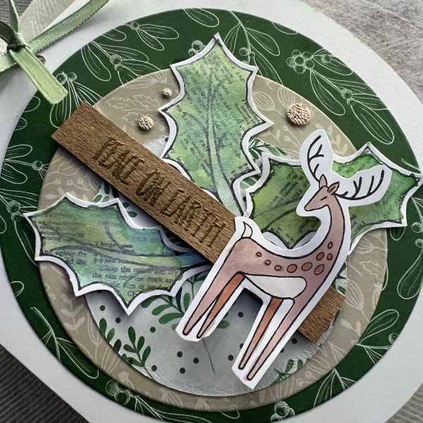
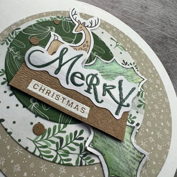
Week 2 of my attempt to do something Christmassy every week … just one card this week … again using up bits and pieces off the desk like last time.
This time I used a piece of dsp and then one of the stitching trees to make up this card.
I decided to emboss the background panel with the fern folder.
Love the texture this gives.
I added the die cut sentiment and then added the die cut circles as embellishments which I added some glossy accents to so they have some lovely shine.
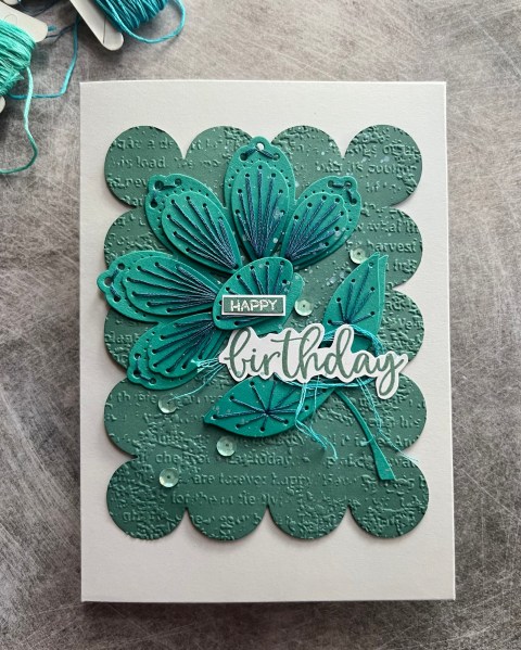
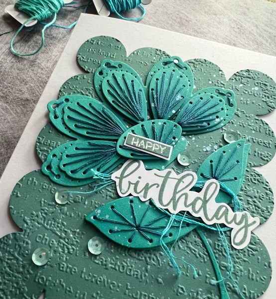
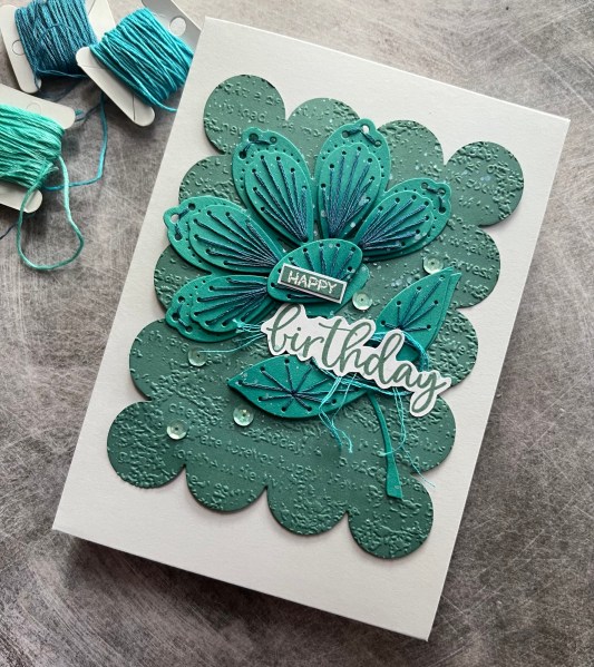
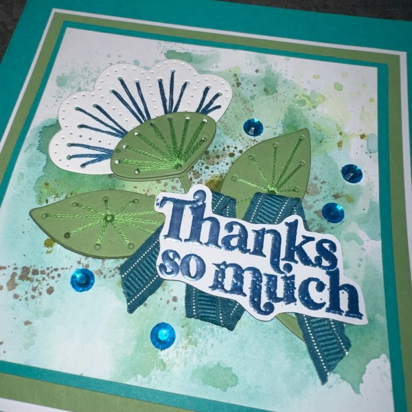
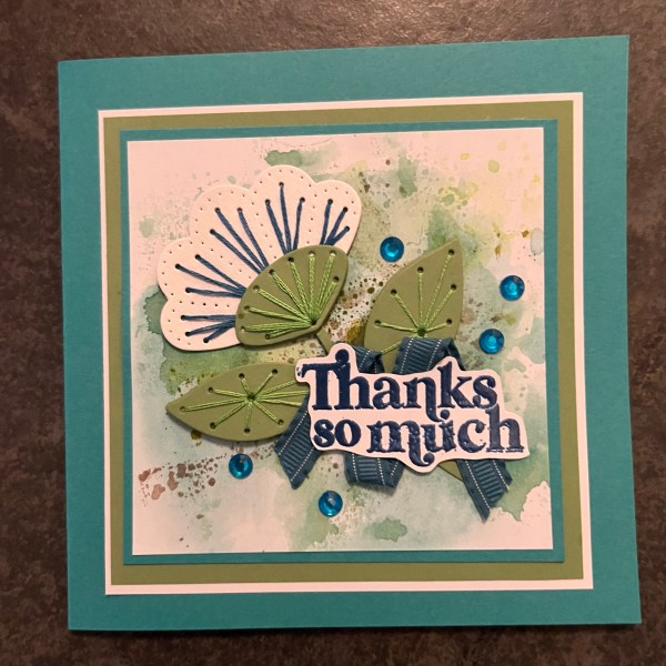
Today’s stitched card makes use of both the November and the December monthly stitching for kit from spellbinders. I decided to go monotone for the card with all types of teal!
I love teal so why not go over the top with teal coloured cardstock, ink and stitching!
Ok let’s start with the flower. I die cut all the pieces from what I think was Bermuda Bay. I added some ink to the centre of the flower and the bits of the petals and the leaves where they connect to the flower stem to give dimension. Then I stitched using a dark teal thread.
Next I die cut from Lost Lagoon cardstock the background scalloped piece … isn’t this a fun shape? I inked the edges with the lost lagoon ink to give it some depth and made it lighter in the centre. This is quite subtle but still I was pleased I remembered to do this.
Then I embossed it and added the flower to the card. I then decided to go splatter mad with a shimmer watercolour paint.
Next the sentiment is a mix of stamps and the little happy is embossed. I like mixing up sentiments like this especially when one of the words is a bit bigger. I added some lighter colour teal thread beneath the sentiment to be in keeping with the monotone look.
I finally added the sequins for a little more bling – again the colour worked well with the rest of the card topper.
I stuck the topper to the card blank with pinflair glue to give it a little bit of dimension.
Love this. Love the colour and the textures and the shape of the scalloped topper. Fun!
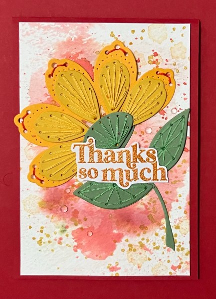
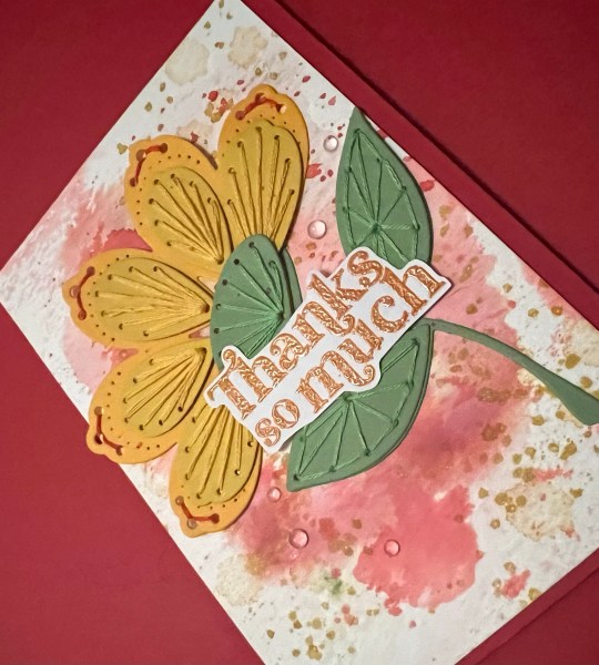
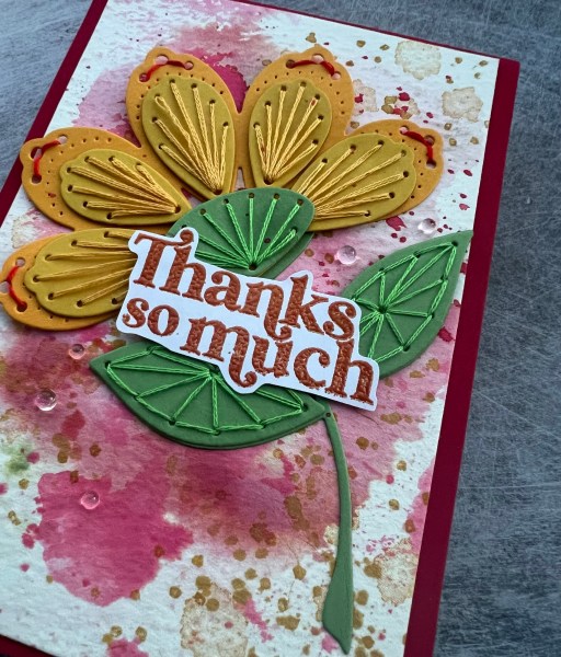
I die cut more of the flower elements from the November Spellbinders stitching die of the month kit and had a play. This time I chose the really big flower head. I chose the yellow colours but wanted to bring in red so that was the colour I chose for some of the stitching.
I had cut the individual petals from a different yellow colour which gave it a nice tonal difference.
After putting together the flower I then had to choose how to finish off the card. I chose a piece of watercolour card that I had previously wiped off and this had a mix of reds and pinks on it.
I then chose some stamps from the Artistically inked set and added some extra yellows … to be honest this didn’t come out very well as the watercolour card isn’t great to stamp onto with the texture but it added in the colour. I then splattered both a red and a yellow ink and as my water had shimmer in it this came out a little shimmery.
I used the same Concord & 9th stamp for the sentiment and once again I embossed it … this time the orange powder which I thought worked well with the colours.
I then added clear gems for embellishment.
I added the panel to a red card blank and called it done!
I’ve since die cut many more of these pieces so I can sew them at leisure and make up more flowers like these in lots of different colour ways. They make such a lovely focal point for a card.
Prepare to see more of them!
I’ve decided to also try and remember to do a few challenges as a participant this year … this one I am entering into the contains flowers challenge for Beautiful blossoms
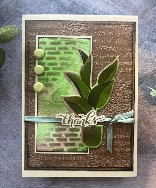
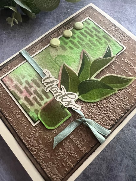
Todays card came from playing with a piece of inked watercolour card stock and I just grabbed the houseplant stencil and made a plant from it and then inked up the panel that was left with the brick motif as a topper panel.
I then got out some Kraft and inked and embossed one panel and then added a piece behind it where I inked the edge too.
I added the wrap of the ribbon and the sentiment and the card candi as enbellishment.
Another thank you card made this time using the fabulous stitching dies from Spellbinders – this one was the November 2023 kit.
First I die cut the pieces out and then got out the threads and needle to stitch up some pieces before I glued it together with the pinflair glue gel to keep the dimension.
I pulled a piece of inked cardstock which I thought worked with the colours I had used. I then added lots of mats and layers for the central piece.
I embossed the sentiment from Concord & 9th and fussy cut it out. then I had a hunt through the ribbon stash and selected this piece again because the colour looked right with the rest chosen.
I also grabbed some random turquoise gems to finish off.
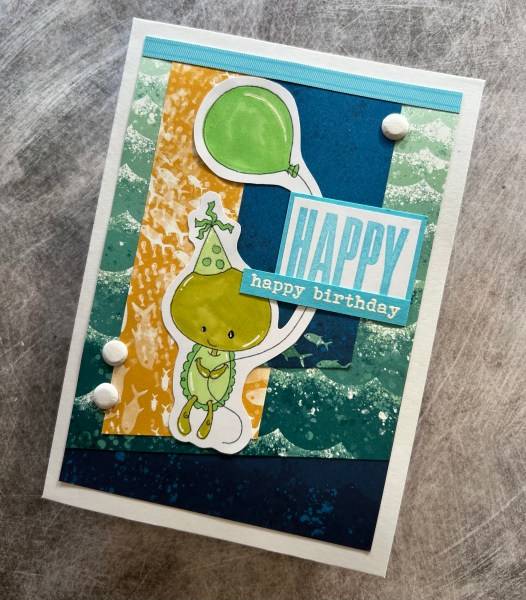
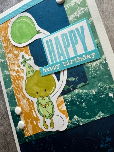
Hello! My first design team contribution of the year is this card I made for Creative Knockouts using the image Funny little turtle from Streamside studios.
I found the Whale of a Time papers in the stash to go with the theme and coloured the image using my promarkers.
As I will likely be using this for one of my great nephews birthdays in a few months time I kept the right hand side free for adding the number for his age nearer the time.
I also kept the embellishment simple with just some Card Candi and wink of Stella on the balloon and the hat for the little turtle ! 🐢
The sentiment I added the embossed strip as well as the larger happy from Biggest Wish.
Love how this came together and isn’t he just the cutest guy?
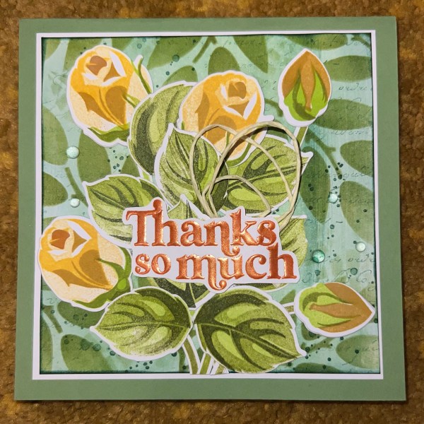
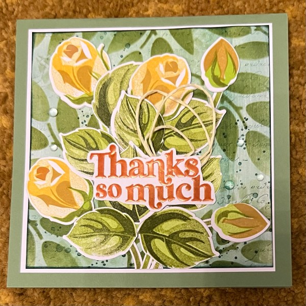
I put together this thank you card using some roses I had already stamped and die cut. I did stamp and die cut all the leaves out though as I hadn’t got any left ready done!
The background had some ink smeared on it when I started but I added stencilling of two different leaf designs. I also added some stamped text and the splattered ink spots.
Most of the background is clearly covered up but I really like the way this came together.
I added some paper string and an embossed sentiment to bring focus to the centre of the card. I also added some clear gems to finish off!
I used a green card blank which I think brought all the elements together.
I know I said not daily posting but I did get quite a few projects done during the Christmas break so I have a few posts coming up on the run!
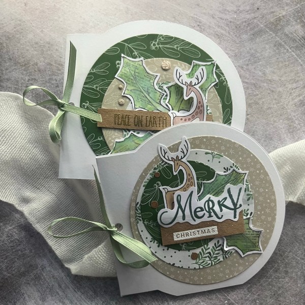
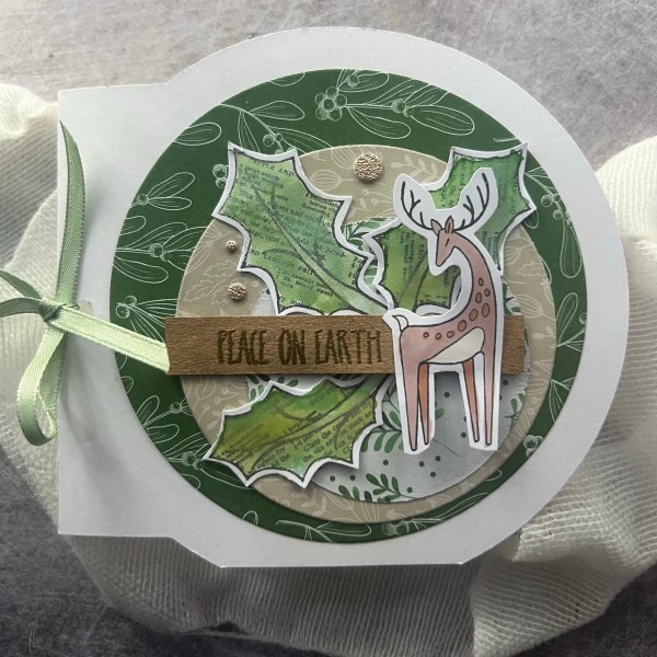
I made this card for my parents stash as they often send anniversary cards to their friends (not something I ever think to do!). This was one of the things I was doing on Christmas Eve but saved to share with you until now!
I used two of the stitched flowers from the Spellbinders stitching dies I’ve been die cutting and sewing obsessively for the past few weeks … I have a pouch full of them now so expect a lot of stitched cards in the next few months.
I decided to make a card with some splatter and then the fabulous die cut anniversary sentiment.
For the flowers I only stitched the flower (two parts) and left the leaves plain as I was tucking them behind the sentiment die cut.
The background panel I inked first a little with the blackberry bliss ink so it gave some different shades and then when that was dry I embossed splatter using the gorgeous grunge stamp and gold embossing. Next I wanted a different colour splatter and took some shimmer watercolour paint to add some purple.
It doesn’t show so well on the photos but works well in real life and it breaks up the background.
I then added the gold gems too for finishing touches. I think this is an elegant card and quite chuffed with it! Also have to admit that die cut sentiment has been on my desk for months awaiting use so pleased to have found the perfect project to add it to!
Happy new year! I hope you have enjoyed the passing of another year and the start of a fresh new one. I’m planning a slight change of pace with less design teams this year and doing a little thinking about what crafting I want to concentrate on for 2024.
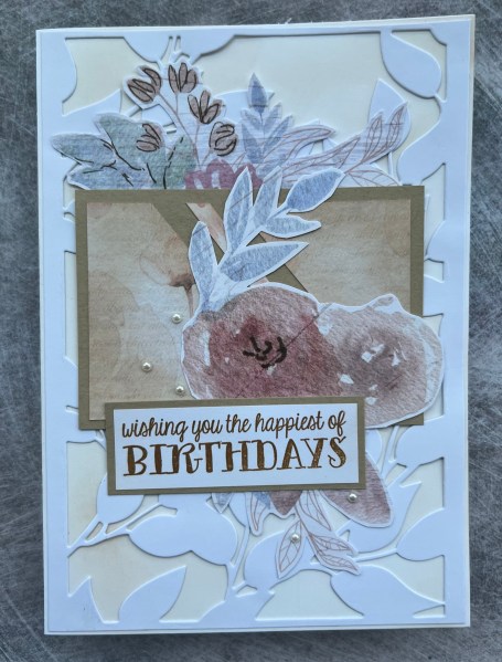
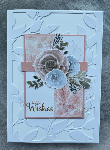
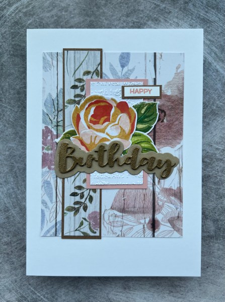
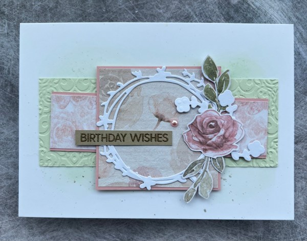
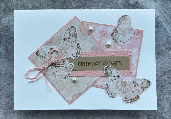
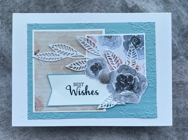
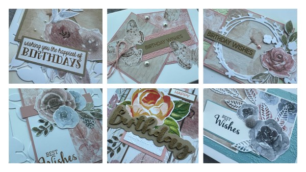
One thing I am still keen on doing is using up the patterned paper so I’ve decided I will keep to that as my first of the month challenge as that’s worked well for a few years. Not sure this year will have the same theme for this each month but I’ve started with this month by getting a Cards by Kendra challenge template and made some cards following that.
This post shares the first few cards I made using the template. I didn’t actually finish doing this one yet as I ended up tidying it into a folder as I needed to clear the desk so so far just got these few sorted.
I decided to add some different backgrounds to these cards so I added some die cut and inked backgrounds behind the main elements from the sketches.
I also chose other pieces of the patterned paper to cut apart for embellishment.
I also added in die cut elements and sentiments and bits of thread or ribbbon to embellish. I also thought pearls worked well for most of the cards as further embellishments.
I added in a bit of embossing to add texture on a few along with some simple white die cut elements.
All of these are birthday cards and I think they make a nice set all together. Still so grateful to my friend who gifted me the Crafters Companion dsp.
So not a bad start to the year.
One thing I have decided is that daily posting is exhausting (managed daily in December in the run up to Christmas and did a few longer stints last year but it is just so much pressure and I don’t need that) so not going to try and do that but will try and create regularly so there is something on the blog often … but daily is a tad more than I can cope with!
Now to make plans on what else I fancy doing this year craft wise! I definitely think I want to try and do a bit more mixed media as I’ve missed routinely doing that… and I am loving the stitching dies from spellbinders so suspect you will see a lot of things made with those … but other than that I am open to ideas. What are your plans?