I am an on-the-side and increasingly up front papercrafter who loves nothing more than getting inky and creating pretty things with paper and stamps!
I am also a wife to lovely hubby and mummy to a wonderful 14yr old princess.
When I saw the Spellbinders stitching die kit for January I couldn’t wait to get the bee and stitch… however it took weeks before I got round to diecutting it and stitching it!
I die cut the yellow from cream card I added yellow ink too which gives it a more gradient finish.
I decided to use the same colour of thread for the whole of the bee 🐝
I then chose to die cut the wings from some shimmery cardstock rather than the usual cardstock. I also chose to use gold metallic thread for the wings. My goodness this metallic thread is so much more tricky to work with than normal silks.
Once I had stitched all the elements I then had to work out what to do with the bee. I decided to keep it really simple with a stitched frame and a black mat layer.
I didn’t add a sentiment and kept it as it was especially as the bee is so spectacular!
Today’s festive Friday started with a piece of dsp I cut into four panels and embossed the Snow Crystal on … two white embossing and two clear embossing. Then I took two panels and made two cards. I ran out of time for the other two so they’ve gone back into the box for another time!
I decided to make two cards with the same set of supplies but make one clean and one grungy!
Sorry the colour is a little washed out in them though … the sun was just going down by the time I took pictures!
I started with the grungy one … I inked up the panel with different green inks to give contrast to the embossed snowflake in the background.
I also stamped the snow Crystal again using a dark green ink. It is all quite subtle because the paper is already quite dark but it gives some interest to the back of the card. Then I inked up the strip of the checked paper (this is the reverse of the dotty paper and I had a few 1” strips left from cutting up the panels).
I added that to the background and then used a piece of white cardstock to emboss with the word folder. I then inked it with the different greens.
I added some ink to the bakers twine and made that more in keeping with the background before adding that in a messy twist underneath the Paper Doll image.
I then inked up some strips and added the stickers as sentiments.
Think if I was to do this again I would remember to splatter as I completely forgot until I type this now!
Now the clean version no ink was added to the background papers, only to the embossed piece of white behind the image.
I decided to wrap the bakers twine (without inking it) to keep it cleaner and no ink on the sentiment strip either.
I rarely use the paper dolls but I think they worked well on both these cards as a fun vintage element with the dotty paper and the plaid with the gorgeous snow Crystal image.
I think that the one I prefer out of these two is the inky grungy version … but I do love that white snowflake too! What do you think?
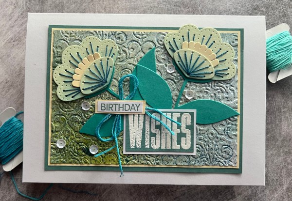
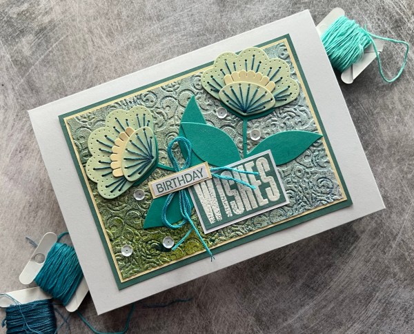
Today’s card is one where I was just playing with a few bits and pieces but ended up with what I think is quite a cool card.
Let’s start with the background.
About a year and a half ago my daughter did a photo shoot for her AS Level photography using my art supplies and made some spray backgrounds and I kept them and have gradually been using them up on cards. Well this is how this started … with yellow and blue dylusion sprays!
I inked over it lightly with Lost Lagoon ink and then decided to emboss the background but added some versamark onto the debossing part of the folder so I could emboss into the impression. Well it didn’t work very well but it did add some blue embossing in some places. So I then decided to ink some of the rest of the panel with versamark and add pearl embossing powder to that. This created this cool textural and shiny panel. It’s difficult to photograph but I think you can see the texture and shine on this angle…
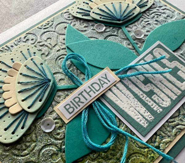
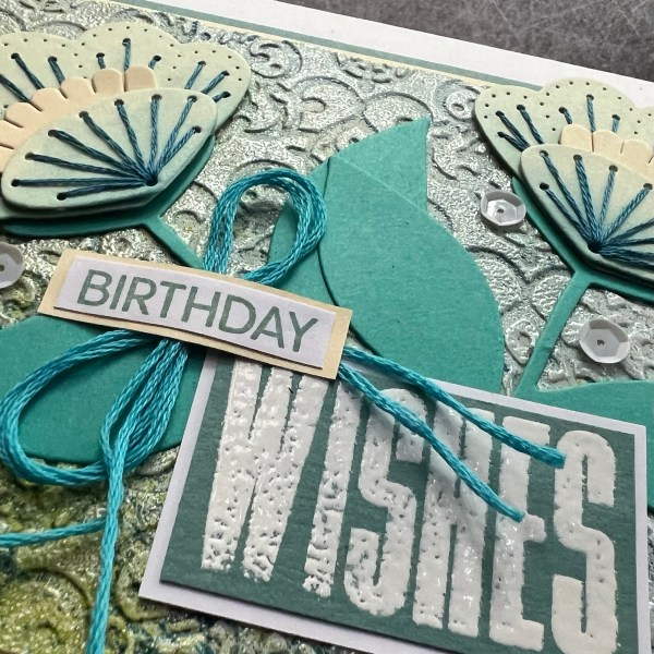
Once I had that I decided some flowers would be good so I grabbed them from the pouch of stitched flowers I already had and two of them I had stitched in the blue and added blue ink to them too! Perfect for the colour scheme of the background!
I kept the leaves flat but added the flowers using pinflair glue gel to raise them slightly.
After adhering the flowers and leaves I decided to pull together the sentiment.
I chose the big wishes from the More Wishes sentiment set and then birthday from a waffle flower set. I decided at this point to add in some white as I knew I would be using a white card blank so needed to add white in alongside the cream used for the flowers and the mat of the background.
I stamped wishes onto the lost lagoon cardstock with versamark and white embossed it. I matted the sentiment in white. Then for the birthday I stamped in lost lagoon and matted it with the same colour card stock … this way they coordinated with each other.
I also then added the mat of the lost lagoon to the full panel.
I also added in a bow using the lighter teal coloured thread to go under the sentiment.
Finally I added some white sequins for a little extra sparkle!
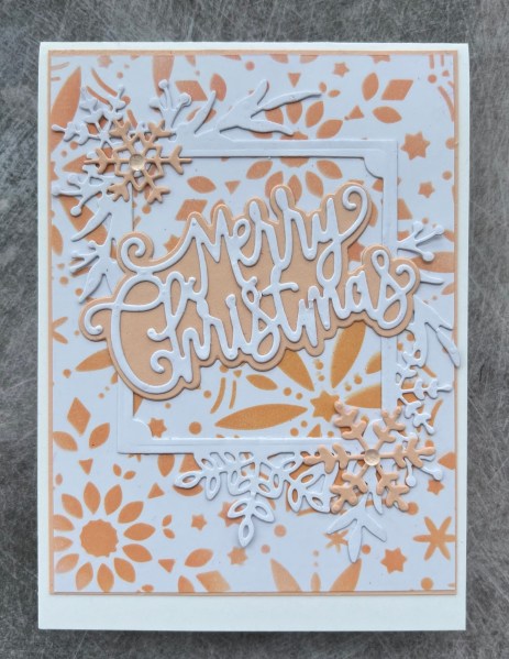
I’ve actually got three cards I made for this design team contribution for Addicted to stamps and moreas I wanted to play with new inks from Concord and 9th … so I ended up with three monochrome cards of similar designs!
I started with the three inks and a greetery stencil and did three panels of white cardstock, one for each colour.
Next I die cut the frosted frames in white three times with cardstock that I doubled up to make it stronger.
I also got out an old tonic sentiment die with the shadow and die cut that with both white and coordinating cardstock. Admittedly the cardstock isn’t identical in colour as I don’t have the Concord & 9th cardstock but I chose colours that I thought worked well with the inks.
I stacked up the card fronts adding a panel behind each in the coloured cardstock.
Whilst the colours are non-traditional for Christmas I think they still make pretty cards. I added the coloured snowflakes as finishing touches to the frames and love how they turned out! I just added the little clear gems to the centre of these snowflakes to finish off with an embellishment because you know me, I can’t resist!
Simple and modern.
Hope you join us at Addicted to stamps and more for Christmas fun!
Finally used up the patterned paper piece I started playing with on the 1st of the month. This time it was a larger panel but cut it into two pieces and used some stamped images from a magazine kit to create the focal points.
This first one I started with the panel and used a couple of different yellow distress inks to add colour to the background. Then layered it up onto white before grabbing bits off the desk to make it into a cluster for the centre of a 5×7 card blank.
I chose a flower I had coloured yellow and then also added in the die cut leaves from the Altenew Zero waste die set which I coloured with the same colour stampin blends as the leaves on the flower.
I chose the sentiment from Waffleflower stamps and then decided to add a little interest to the centre of the background with the stencilled circles.
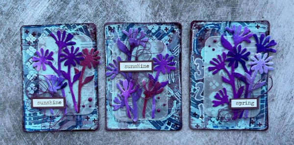
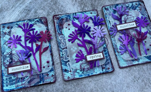
This card started off as the palette for my ATCs I shared the other day … although that’s not entirely true … it actually started as a piece of art I had made and popped in a frame many years ago but fallen out of love with. I used it as a palette for the paints and then cut a panel for the card background and carried on creating on it so it ended up matching the ATCs.
I used stencils, paints, Dylusions spray inks, stamps and posca pens to create the background. Then stamped and edged using the stampin up Rich Razzleberry colour.
I also created lots of the flowers using some old watercolour paper and Dylusions inks and brushos to make varied purples and cut it using creative expressions dies.
I cut a vellum panel using tonic curved stitched rectangle die and added the flowers to that and then added the sentiment from biggest wish to it with a mat of the painted paper I had left over.
I added a mat of the white and then added it to a Rich Razzleberry card base.
Final touches were to add the enamel accents as embellishment.
Another card using my new stash and this time I did the die cutting first and then added the stencil which meant it lined up well!
This created a lovely clean background with the die cut elements that add lovely texture.
I decided to add the extra leaves with the diecut texture and just added the colour through the stencil.
I decided to add a panel of a die cut rounded rectangle. I raised it up on some foam to give dimensions.
I then added some stickers for the sentiment and some die cut circles for the embellishment. I also added some little doodles in white gel pen for the finishing touch.
I love the stitched details on those dies plus all the texture created by that background panel.
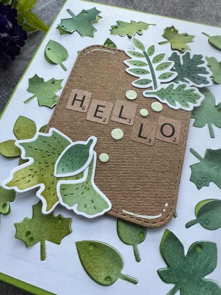
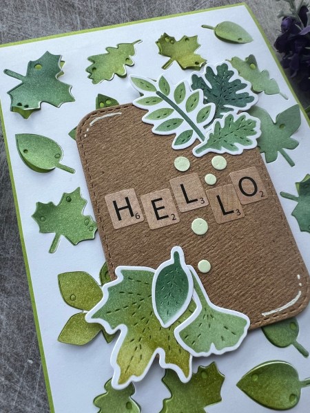
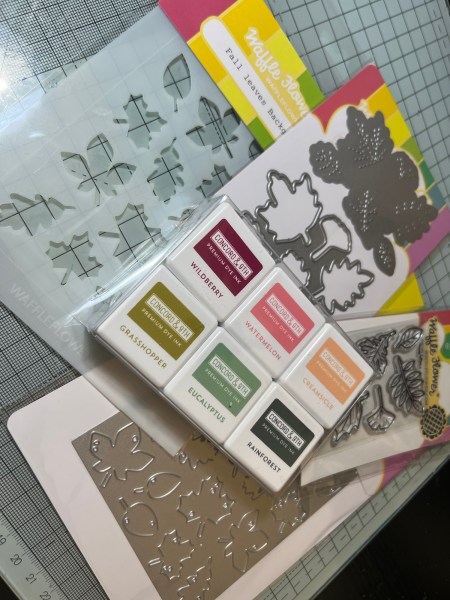
Love this collection of supplies and love the Concord & 9th inks. They blend so nicely. Looking forward to playing with the other colours.
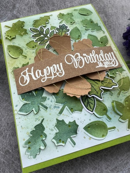
Firstly new inks from Concord & 9th and then the fall leaves collection from Waffle Flower.
I started with a card that didn’t quite go to plan …
I started with the stencil and added the three green/blue inks but then realised I should have die cut first as it’s impossible to line up and didn’t manage to get it straight.
So to make it less obvious I decided to then ink up the background too including some splatter!
Next I stamped the images and then blended over the top of them using the small stencil that does with the individual dies and then cut them out.
I decided to use the Kraft flower from the stash and then added those stamped leaves around the flower. Next I added the sentiment strip with white embossing and some gold thread for the final embellishment.
I added the panel to a green card blank.
Love the dimension across the central panel and the little bits of movement with the background die cut panel.
I then made a second card using similar supplies but this time doing it the right way round … but you will have to wait till tomorrow to see that!
I made this a little while ago using old papers and a card blank from an old kit that I had lopped a bit of one end off but never ended up adding it to the blog so I gave myself a week off making Christmas stuff and decided to eventually post this! Really need to get some more Christmas projects planned into my next few weeks or will be continually be on the back foot having set myself a challenge of weekly festive projects … anyways … on with this weeks card.
Always fun to put simple cards together from leftover stash!
The card blank has been foiled which makes it lovely and shiny so all it needed was a strip of patterned paper down one edge and then the cluster of papers and cut out paper elements down the middle.
Pop of red helped to make it fun and then the Tim Holtz sentiment cut out finished it off!
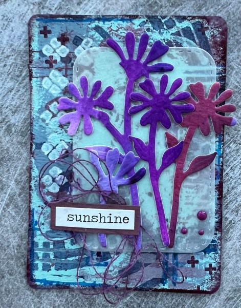
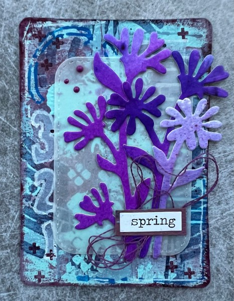
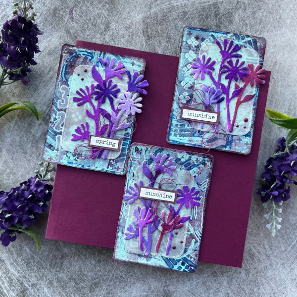
The theme at UK Stampers Forum is Spring Flowers and I decided to join in again this month as I got in the mood to get painty and this is what I fancied making!
Admittedly at first glance these may not appear particularly spring like (usually would have gone yellow for daffodils or white for snowdrops) but my mojo wanted to play with purples so let’s think I was inspired by purple crocus instead even if the shapes of the flower are far from crocus like!
Ah well some days you just got to go with the mojo and where it decided to go and forget the rules!
Also the rule for UK stampers forum is stamping and whilst there is stamping in the background it is barely visible from the way I ended up finishing the ATCs. Oops! Again it is where the mojo took me and I went with it!
The backgrounds were made individually using four different Paperartsy paints, some Dylusions spray inks and posca pens with some stampin up ink used for the stamping and the edging. Whilst the dye ink sits on the paint at first it will eventually settle and dry but be warned if using a dye ink on paint it can smear – not really an issue for this style of making but worth noting regardless.
After making the three backgrounds I added die cut vellum and the flowers that I die cut from some watercolour cardstock I had coloured using both the Dylusions spray ink and brushos giving them different purple colours.
I added some thread in a purple colour underneath the sentiment for each – these were sticker labels adhered to some painted paper and cut out.
Then I added the purple enamel accents as final embellishment and called them done!
I did also make a card using the piece of paper I had been using as a palette but will share that another day!
Happy crafting!
Catherine
Last minute edit … the photos I don’t think showed the colours well so the next morning took this which seems more true colours … well that’s what I think anyway!