I am an on-the-side and increasingly up front papercrafter who loves nothing more than getting inky and creating pretty things with paper and stamps!
I am also a wife to lovely hubby and mummy to a wonderful 14yr old princess.
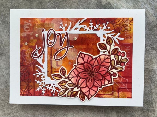
This time I added die cuts from the Frosted frames to break up the background.
On the green one I cut down the background a little and then stacked up the inside panel a lot with both Kraft and white cardstock so it sits proud of the rest of the frame.
I then stamped the sentiment with green ink and added clear embossing to the top to make it shiny and slightly raised.
The red one I went back to the stamp set I had used in the background and created a watercolour floral element and did the watercolour with the same colour inks and then emboss the line art over the top again.
I then used the Colorado Craft company to stamp and die cut the sentiment.
Doing this one did make me inspired for the next two cards I will share on a different blog post… but before I get to those … I added the little die cut rose gold die cut circles.
Love how these turned out… but wait till you see the next ones!
A few months ago I made two masterboard backgrounds as I was inspired by a Jennifer McGuire video to just play with the stash I have got and I then made some cards … a total of six so far but will share them over a few blogs to spread them out.
Let’s start with the how… I tried to remember to take in progress pictures.
I started by creating the first inky layer with the brayer just like Jennifer. She then did a spray of the distress mica sprays but I don’t have any so I made my own using Dylusions and some perfect pearls. I used yellow for the red coloured one and then added some blue to turn it green for the blue one.
You wouldn’t believe how sparkly this makes them … they look gorgeous but it never comes out in photographs so you will have to take my word for it … super ✨ soarkly!
I did the same as Jennifer did and cut the panels up first and then taped them together. Next I added stamping, stencilling and had lots and lots of fun!
I started by die cutting the panels with the pierced background die from waffle flower and then cut them into angled panels.
I decided to keep it simple for the first two…
I stamped and embossed the deer image and stacked up the cardstock so it was nice and thick and fussy cut it out.
I stamped and embossed the sentiment and then added some gems.
The pierced die cut adds some extra subtle elements.
For this one I blended ink onto some scrap and then embossed the Darcy holly leaves in silver to coordinate with the embossing in the background.
I then added sequins to embellish and the embossed sentiment layered up on the green leftover panel.
I’ve shown this many times on the blog … using up bits off the desk to make a card. Todays is another one of those.
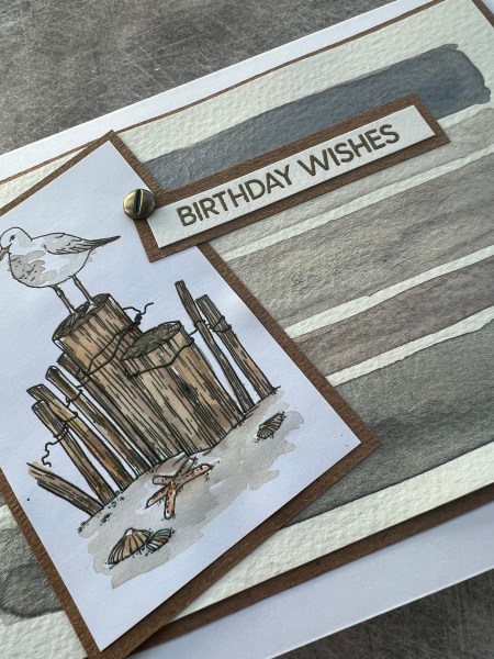
The background uses a piece that had a few mop up splatters … so I embossed it, lightly ran over with an ink blending tool and added lots of splatters to it in the colours I thought would work with the seagull image.
The seagull digital stamp was already printed off and still on the desk having used it a week or so ago for another card. Perfect for cutting out and loosely colouring with ink and water brush.
The Kraft card I embossed with some ink on the embossing folder to give depth to the embossing colour. This was just a scrap sitting on the desk that was the perfect size for this layer.
The ribbon I did hunt through the stash for so that and the paper clip I added rather than just grabbing from the desk.
The teal card was some scrap where I had wiped off the brayer … there was only a small piece left but I loved the texture on this so glad to have found a use for it.
Finally the sentiment … I often stamp multiple sentiments in one go just in case the first doesn’t work out and this was one left over from another project … just needed cutting to the right size and adding onto the card.
I chose a watery teal colour cardstock for the blank and then added the card front panel to it and an insert inside to finish off!
Oh those Kraft circles are leftover bits from the zero waste leaf die I had cut (I’ve kept leftover circles in a little pot for using as flat embellishment!)
I have had this Mama Elephant stamp (plus the cat version and the snowman version) for a long time. I love them, but rarely use them and I just had a desire to use it. So I stamped it, masked it and then stamped it again to create a taller grouping of the pups!
I then used all my neutral promarkers to colour in the individual dogs. They are so so cute and I just love colouring them in.
Once coloured (including the pops of colour from either their accessories or the envelopes) I masked them again to blend the sky area with a mix of different bright blues.
Then I stamped the sentiment on the top and decided to leave it at that.
I did add a little gelly roll glitter pen to the bow ties and the hearts and the top party hat, but none of my usual over the top shimmer, shine or gems!
I mounted it onto a black card blank and added a white insert inside to make it easy to write to the recipient.
Love this image and how easy it is to transform into a portrait image even though it is normally a landscape one!
Watch this space the cat one may have to make an appearance too soon! (And maybe the snowmen one too!)
Hello hello hello … and here is what will probably be my only Halloween card of the year made as part of the challenge over at Creative Knockouts blog. The challenge is actually anything goes but I was given this fun Coso Pumpkin image to work with by Mirtallemente so Halloween happened!
So I actually did something a little weird with this … I printed it out and coloured it using stampin write markers (alcohol markers moves the printer ink so hence the normal pens instead).
But after colouring it I coated it with three layers of versamark and clear embossing powder to create a shiny tile type effect. I love the transformation and the way this traps the ink.
I mounted the panel onto black and then worked on the background. I used some orange cardstock and cut a card blank and then a slightly smaller panel for the background. I added inking to the edges and stencilled some bats using an old Tim Holtz stencil.
I then grabbed some random pieces of patterned paper which I thought worked with the image I decided and went for the distressed look by curling the corners and placing some underneath to peep out. I also inked the green a little and then gave it a massive amount of splatter using both the black soot ink and also some black wink of Stella for shine and sparkle.
I added the focal image with some black brads and then I black heat embossed the sentiment onto the orange and then fussy cut it out.
A perfectly spooky fun card … really enjoyed making this card. I’m popping it in the post to my cousin who I know loves Halloween!
Don’t know why (other than the fact it is gorgeous) but I am addicted to painting with shimmer water colours at the moment. This time I grabbed a digital stamp that was already printed (Alex Siberia one I used a few weeks ago) and painted it using the shimmer watercolours.
I then let it dry before fussy cutting it out.
I then chose a piece of mop up paper and added more inks to it in the colours that went with the flowers.
I also went to town with splattering the shimmer watercolours too.
Once that was dry I ran it through the embossing folder and again added a bit of ink to it to make sure it highlighted a little of the embossing.
I decided to use a scrap of vellum to emboss the sentiment on in gold rather than my usual go to of a sentiment strip. I pierced holes in the vellum to look like it has been stitched. I adhered it too right and then I added a couple of eyelets so I could thread through the cord and adhere it at the bottom. The top left is held in place by the floral element.
I didn’t have quite the right colour of cardstock to mat the panel and I felt it needed more pink so I took petal pink cardstock but inked it heavily with picked raspberry. This gave it the right kind of tone to match with the other colours.
I then added three gold flower embellishments to finish off. Shimmer is not the easiest thing to photograph so this is it under the spotlight to show some of the shine and reflection.
Wonder how many more shimmery cards will get made … or should I pack away my pack of watercolours to make something less shiny?
What I need to do is watch less YouTube videos with people using distress mica sprays … I think this is what is making me go grab shimmer paints and go ultra shiny! 😂
Right that’s that for today. Love this. Love the final effect and really enjoyed having another go with that digital stamp image, it’s probably been one of my favourites I’ve ever been given as part of a design team.
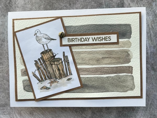
Todays card is featuring watercolour shimmer once again but a real change in pace as I went really simple with four stripes of watercolour and then a digital image water coloured with inks (not shimmer).
Seriously so simple and an elegant (and suitable for any gender recipient) card … well that’s what I think!
I chose neutral colours from the palette (my shimmer watercolours are just cheap ones from hobby craft) and did two wider stripes, one mid size and one narrower.
I made sure I had put down a fair amount of the paint to give it a good amount of colour and shimmer.
I then set it aside to dry.
Next I coloured in the digital image. I’ve used this before for a design team challenge so already had it printed and ready to go. Once that was dry I set it aside before chopping it down into a panel. I then created a mat layer for that and the background from Kraft.
I then heat embossed the sentiment in gold. Layered that onto Kraft too. Adhered it to the front.
I felt it needed an embellishment but something less shiny than a gem or a pearl so I grabbed a screw head brad and added that instead.
Simple but super effective using that background to create a cool and elegant card. Thinking that doing the stripes again in another colour but brighter would also look amazing … but that will have to be another day!
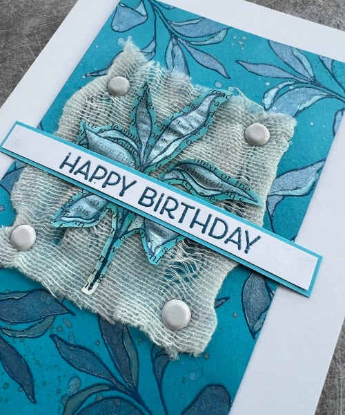
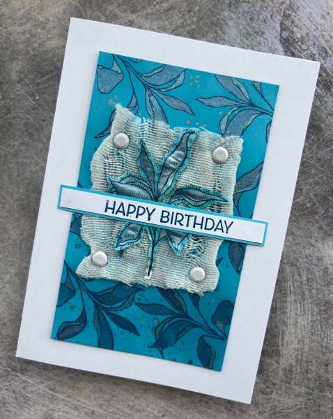
These two cards came about from a random piece of the Tahitian Tide sitting on the desk begging to be used!
I decided to heat emboss the image across the panel with a blue embossing powder and then played with the shimmer watercolours to colour them in. Finished off with a splatter over the whole panel. It’s so shimmery!
I remembered that this image looked nice on book print so I stamped it three times on some book print and embossed with the same blue powder.
I then blended blue and green inks over the three images and fussy cut them out (I forgot I owned the die to save me fussy cutting! 😂)
I then decided that it needed something fun as a layer under the leaf image so I grabbed this piece of bandage and pulled at it so it was different weave… funny how out of date medical supplies end up in my crafting stash!
I secured the bandage into place with brads and then decided that I only wanted one leaf image but it needed shine so out came the shimmer watercolours again.
I then chose the sentiment from the Artistically inked set and embossed it as a long strip and then mounted on the Tahitian tide card to go across the whole panel. The helped to adhere the leaf image to the fabric too.
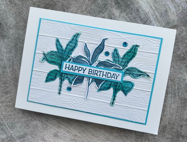
This left me with two book print images left so decided to create a trio with the middle one not being on book print and instead just on white with the shimmer watercolour. I wanted to keep this card simple … a textured background, the three images and a sentiment … oh and three gems to finish.
I did give the white panel a layer of the blue cardstock (I gutted the centre to not waste the cardstock as this is my last bit of this cardstock I think).
The shine on those shimmer paints is fabulous … it really captures the light and changes the shade of the colour as the light moves across it.
I did paint them quite generously so there was a good layer of the shimmer and the embossing helped to keep the sections separated.
Loved how they both came out … really fun playtime was had making them too!
My lovely friend, who has been my manager for the last couple of years has left to go to a new job so here is the card I made her. Went pink and flowery.
I chose to stamp lots of the rose flowers and leaves first and then die cut them out.
I chose a range of pink coloured inks so each was slightly different.
Then I created the background using the leaves and wreath builder tool to create a base of leaves. I then covered most of it up as I had created so many die cuts but still I know it is there.
I also added lots of splatters and then added the die cuts.
I inked a panel for underneath this and then stuck those together . I wrapped the ribbon around the card and then tied a bow to the side.
I then die cut and stacked the letters using Playful Alphabet dies with the top layer using the glimmer paper.
I then inked and punched the banner to stick those onto. I did stack a few other pieces underneath the banner to strengthen it before adding to the side of the panel.
Inside the card I did an inked panel with lots of stamping of random (but clearly meaningful) sentiments including the fab halftone Everything stamp from Altenew.
Zoe has now started her new job and I know she will do a great job (although I also know she has her work cut out for her!). Wishing her all the best.
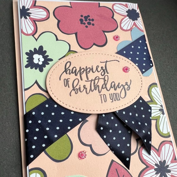
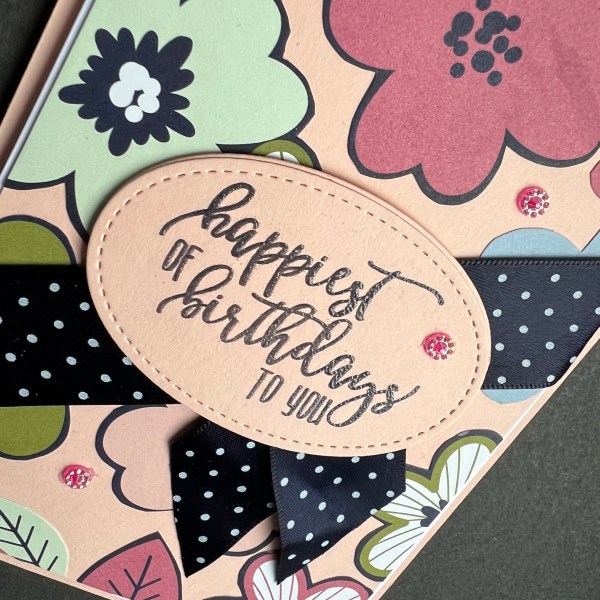
Today I’ve got a cheery birthday card made using some bits and pieces from one of the patterned paper playtime pouches…
I had quite a few flowers left so I created my own background panel and stuck them onto the petal pink card stock.
I then mounted that on white and decided to use this fun spotty ribbon from the stash to wrap round.
I then stamped and embossed and die cut the sentiment using the Picture Perfect Birthday stamps and the stitched framelits. I die cut it three times to make it a nice chunky panel. I also added some ribbon tails coming out from underneath.
I mounted the whole panel onto foam before adding it to the card base made from the same petal pink.
I finished off with some pretty gems from the stash.