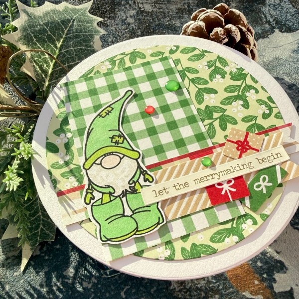
Today’s theme I struggled with. Fortunately Martin included some hints/tips and I saw Santas workshop, thought Elf and went with that as my jumping off point!

I also had been watching a Sarah Stampin Retreat video and she made a circle card – so I cut myself one and went with that for the base!

As per usual I videoed the process (it was quick) of making this card.
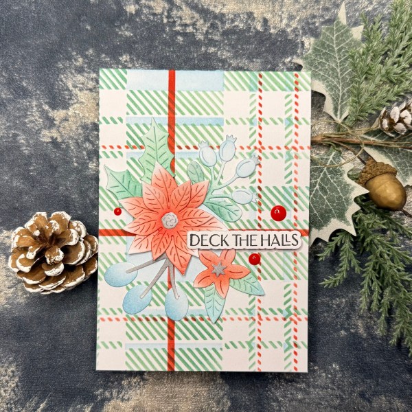
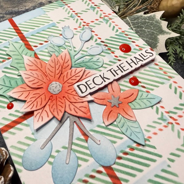
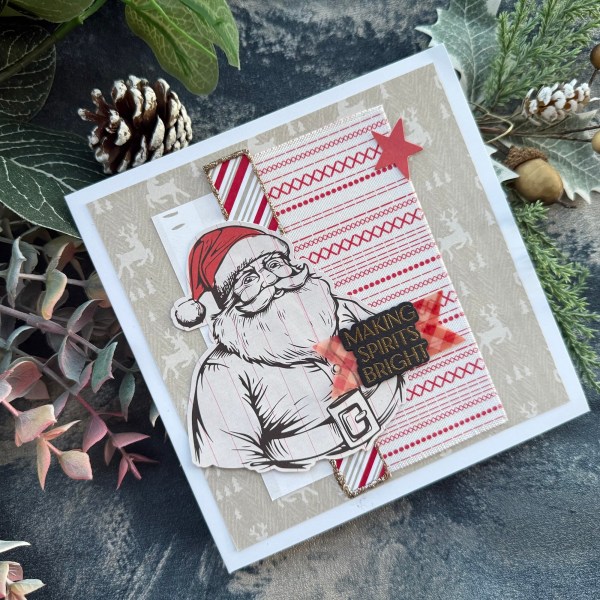
I used the Christmas Tags and More dsp for the papers and the little die cut gifts. I used the Mirtillamente digital stamp of the elf for my main focal point – I just love these digital stamps so much!
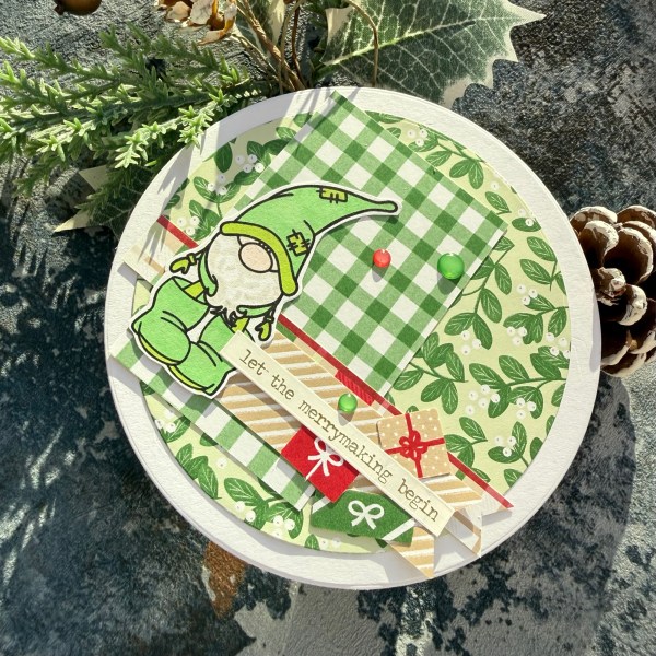
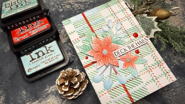
I used my promarkers to do simple colouring and then added the Tim Holtz sticker for the sentiment and some gems to finish off.
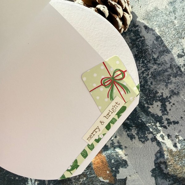
Inside I added another gift, a strip of the paper and the sentiment.
Such a cute card – not entirely sure it is obvious what the theme is from what I did – but that was the starting point of the card!
Happy crafting!
Catherine