Well as the first of the month happens to be a Friday this is a combo patterned paper project along with a Festive Friday project.
I took a few pieces of dsp that I had cut down into 6×6 squares and made a couple of cards that are pattern paper heavy!

Because the patterns and colours coordinate they work well even if they are pretty busy and I kept them very similar.

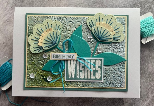
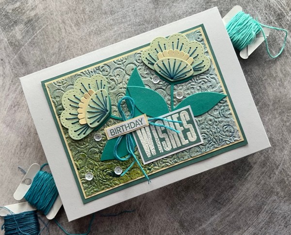
I started by cutting a panel to fit the front of the card blank for both pieces of the paper and then lined them up together and did the same cut across the panel to create the panels I could then put back together with a mix of the papers. Then I took the third piece of paper and created a panel and added a mat layer to break up the patterns.

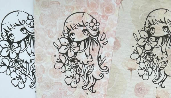
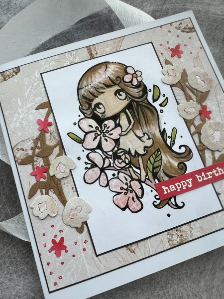
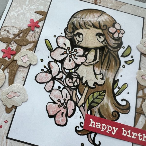
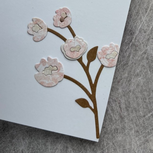
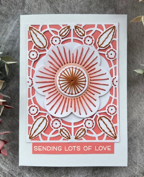
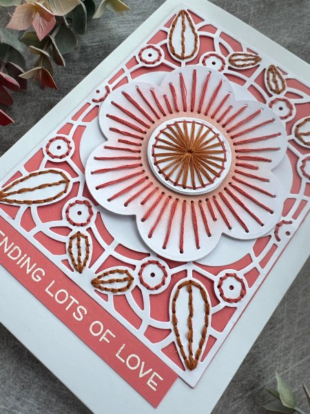
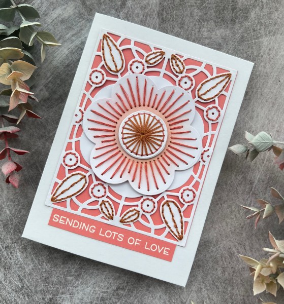
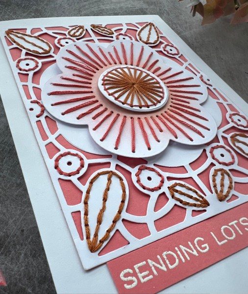
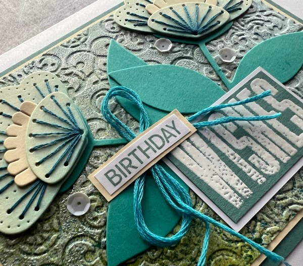
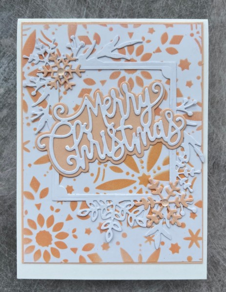
Then I took a piece of white and created my little scene with some magazine kit stamps I’ve had for ages. Under this I added some die cut elements from the Frosted frames set.
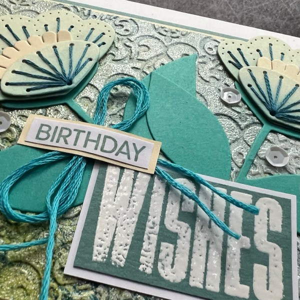
I added some faux stitching doodles around the layers and the same for the little sentiment.

The second one is the same except I used a frosted frames panel to create the scene on so no need to add the additional die cuts underneath.

Kept the layers pretty flat so not lots of dimension to the cards because they are already fairly heavy with the paper and the layers.
So there you go … two cards and two of my challenges done!
Happy crafting!
Catherine